barnes and noble
date
SEPTEMBER 2020
ROLE
CREATIVE DIRECTION
RE-BRANDING
LOGO DESIGN
Challenge
Barnes & Noble, the OG spot for book lovers, was feeling a little outdated in a world that’s gone digital. They needed a fresh vibe that spoke to a new generation without losing the book charm. The challenge was to rebrand to feel more modern and relevant while still keeping its timeless roots intact.
Goal
To give Barnes & Noble a serious glow-up—one that attracts both their loyal fans and the new, digital-savvy crowd. The goal was to create a brand identity that’s sleek, fresh, and has major shelf appeal while still feeling like home for bookworms.
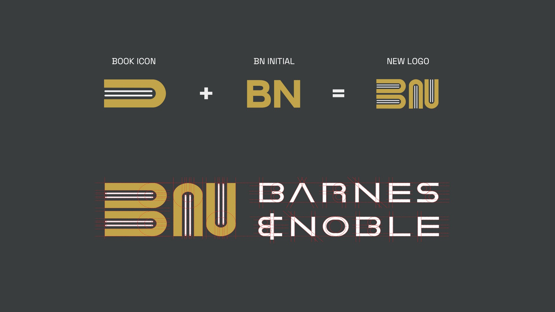
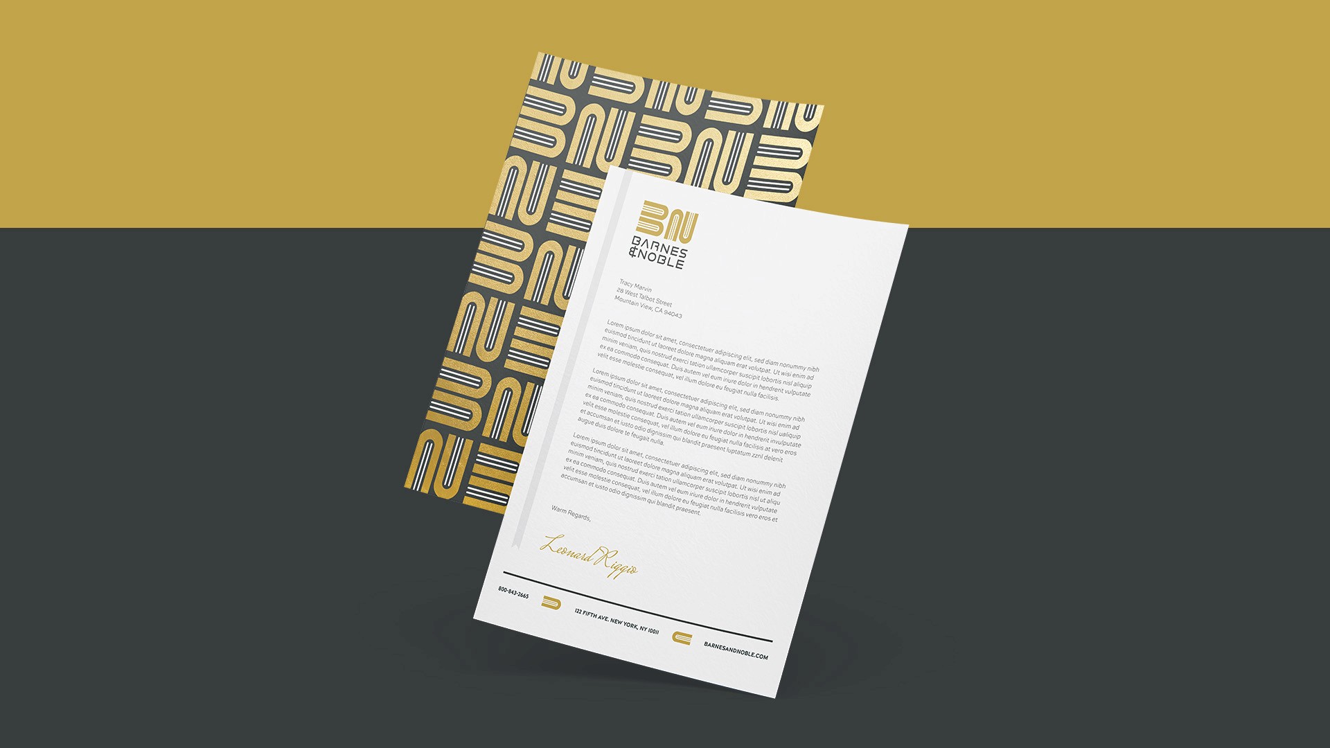
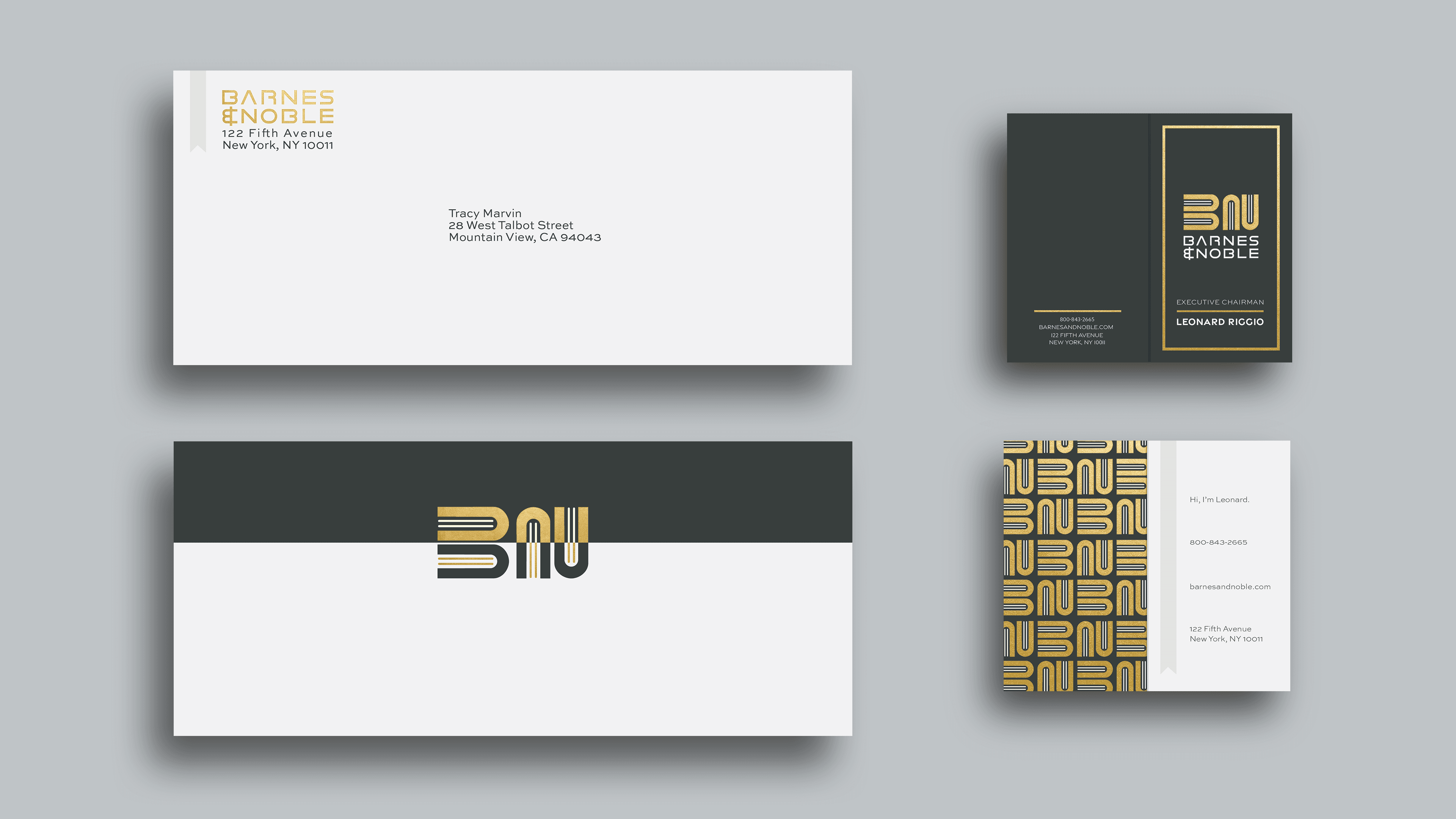
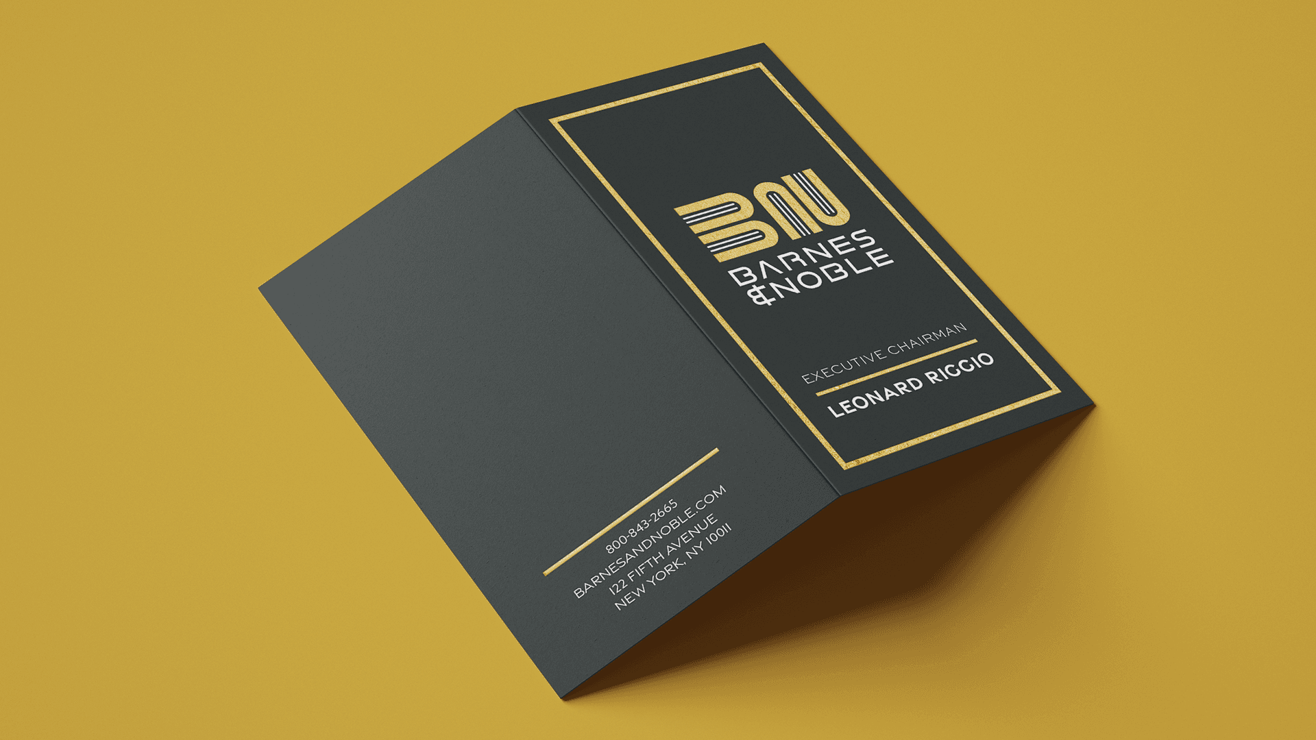
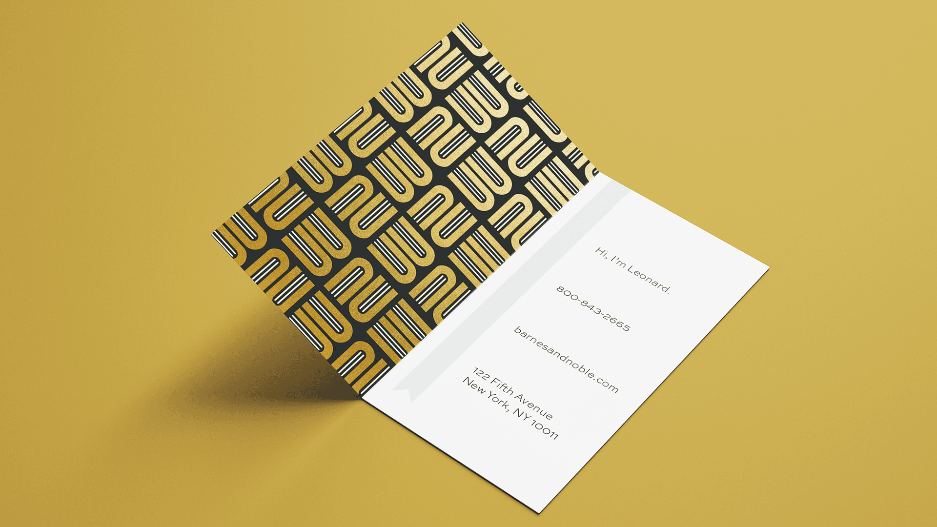
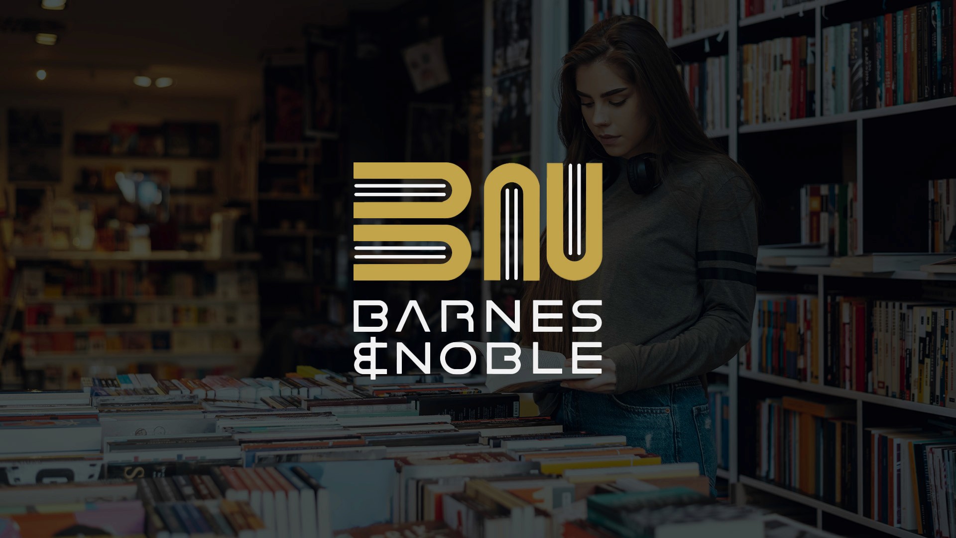
SOLUTION
Enter a clean, stylish new logo that fuses the iconic “BN” initials with subtle nods to books—bridging the old-school with the new-school. The sophisticated gold and black palette keeps things classy, but versatile enough to show up strong both in-store and online. The rebrand nails the balance between classic and modern, giving Barnes & Noble the perfect look to stay iconic and fresh for years to come.