
women with energy
date
SEPTEMBER 2024
ROLE
CREATIVE DIRECTION
BRAND IDENTITY
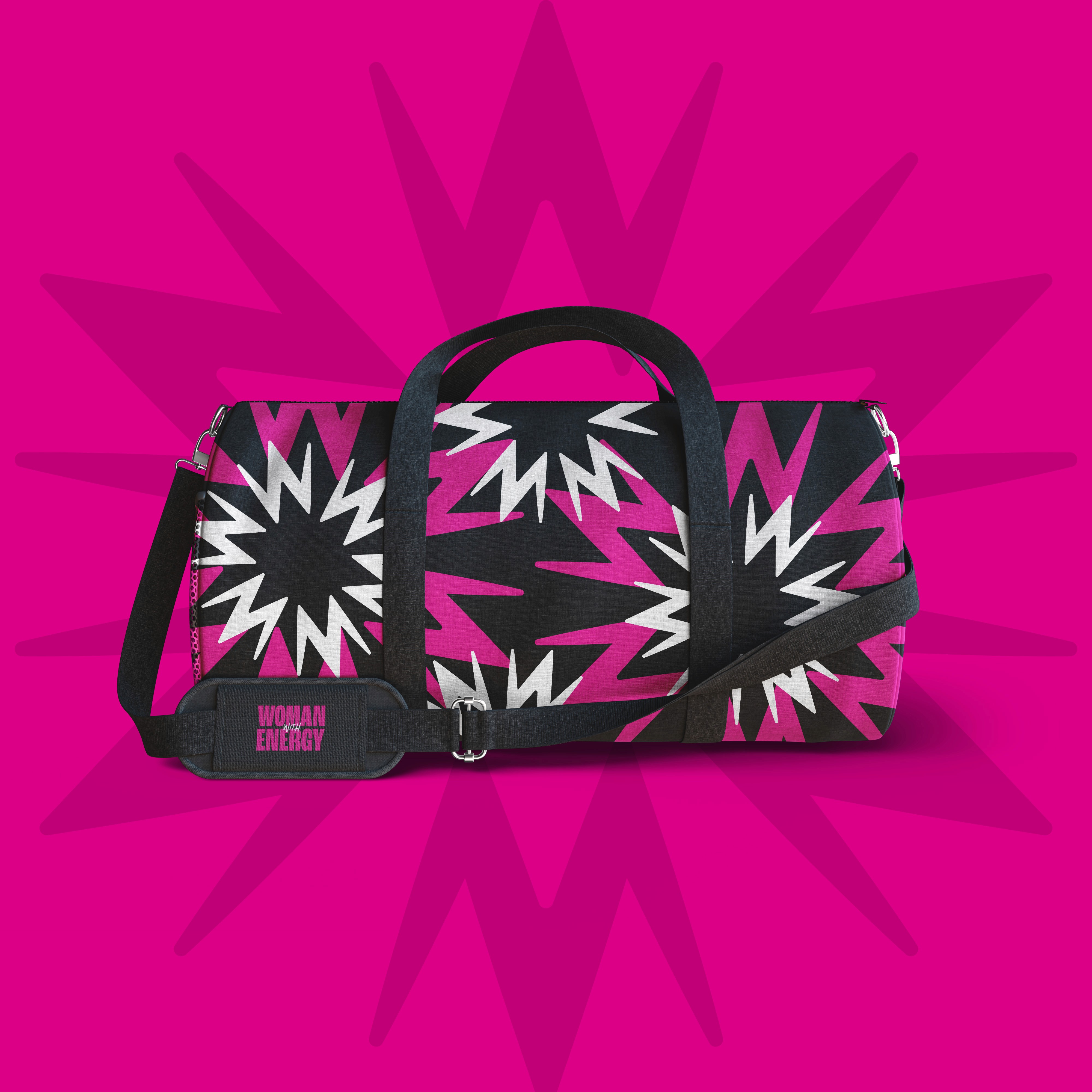
MERCH DESIGN
Challenge
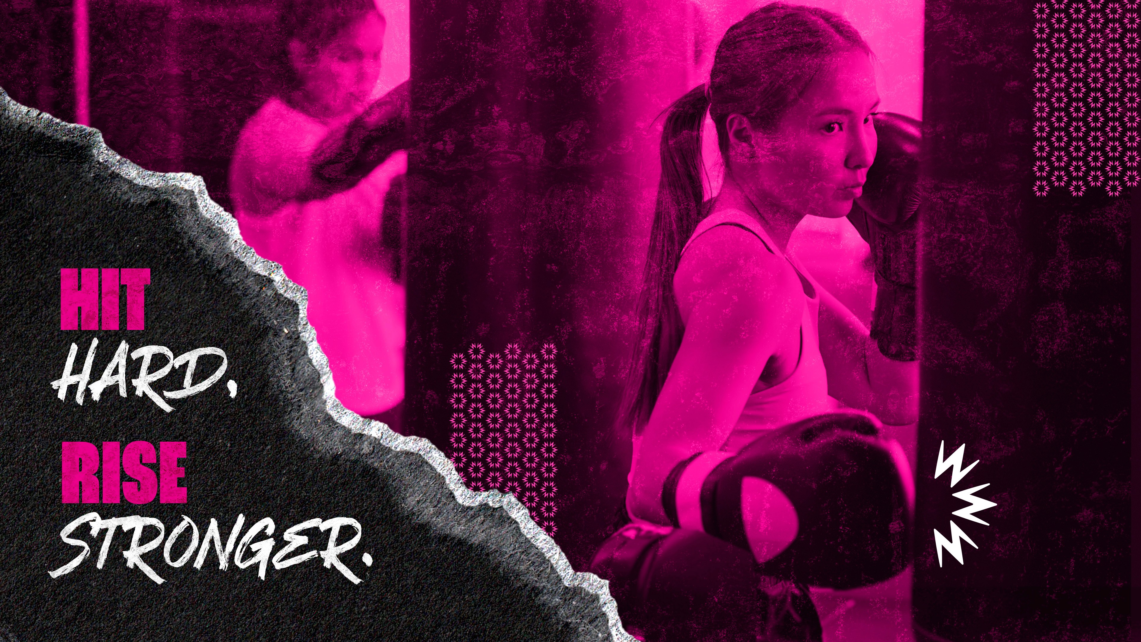
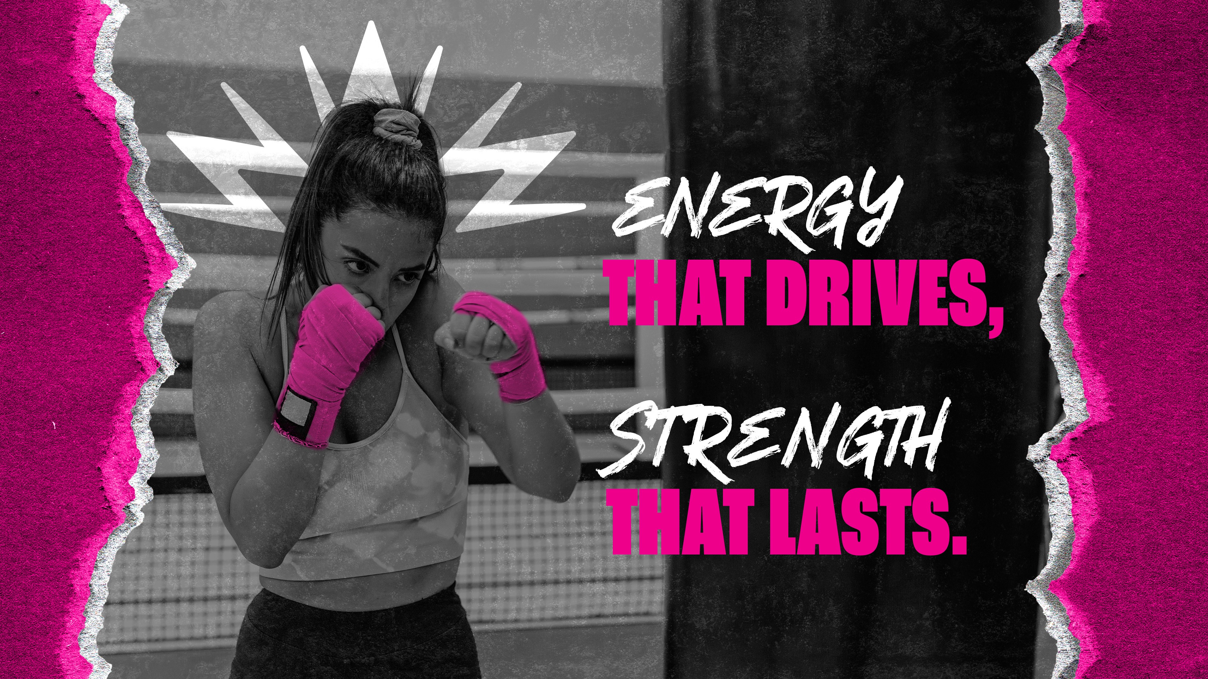
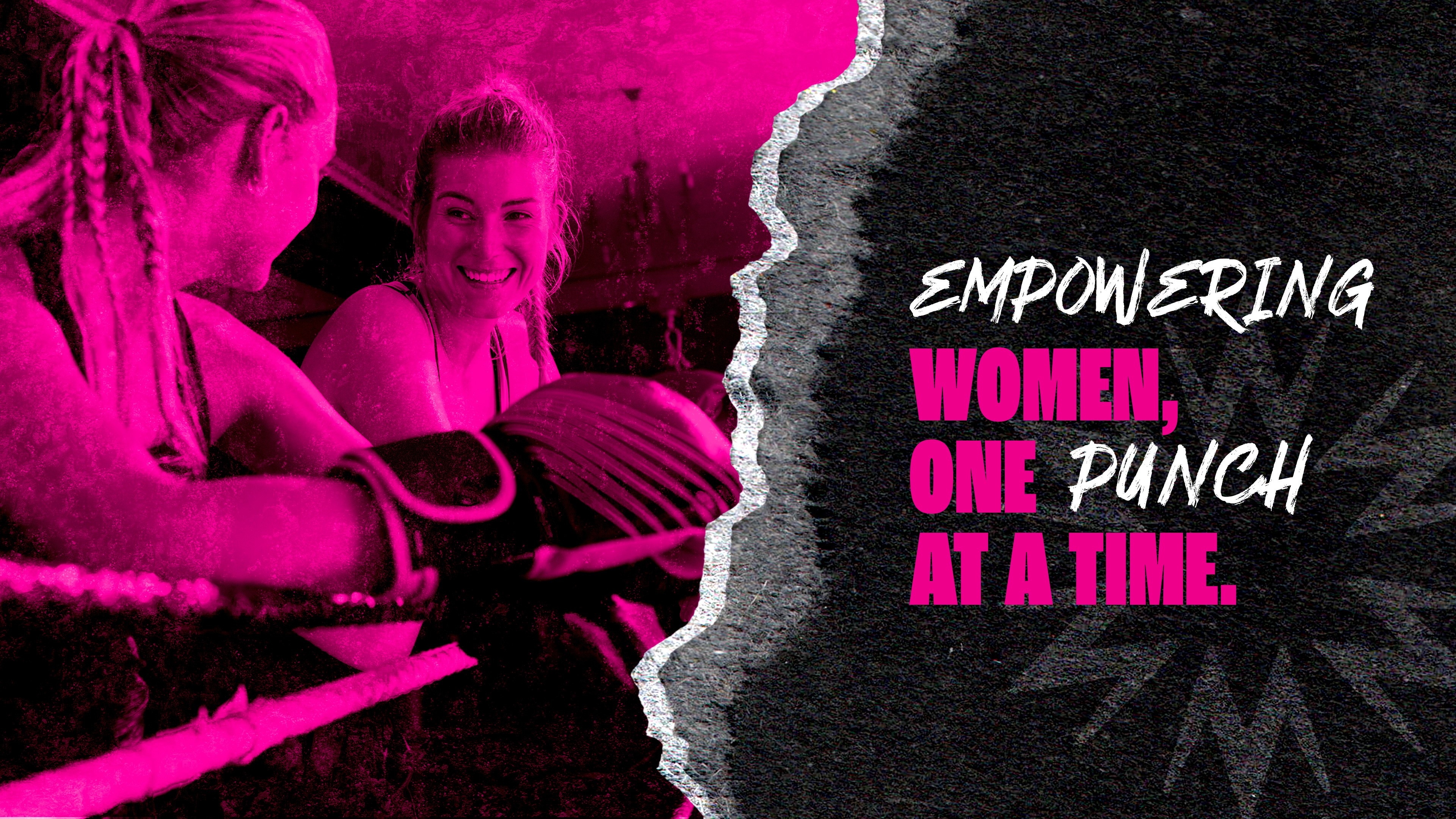
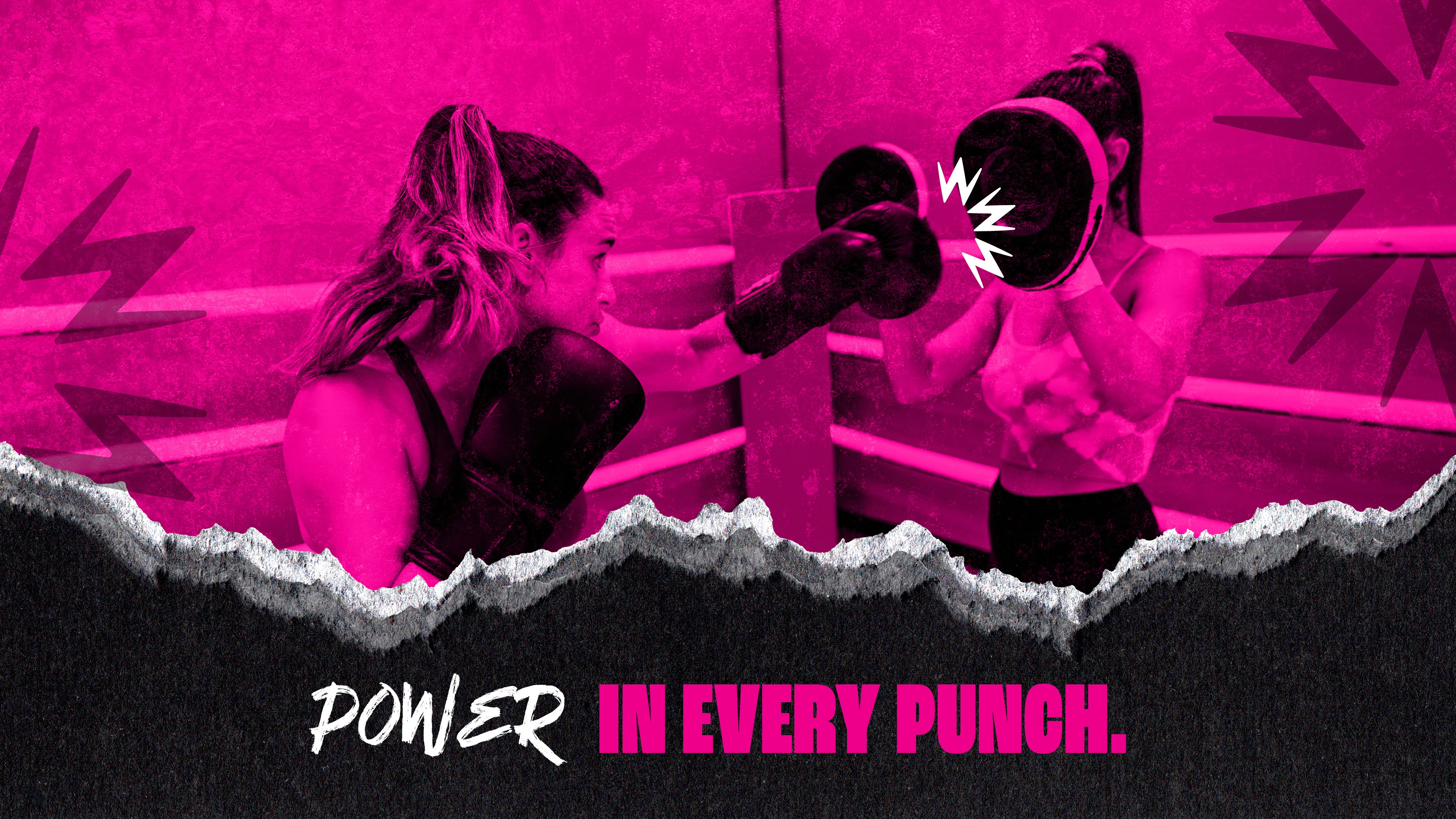
Create a bold, empowering brand for a women-owned boxing studio that oozes power, energy, and confidence. It had to feel fierce and energetic while building a sense of community—something more than just a gym. The visuals and messaging needed to capture the raw power of boxing, while also making sure the brand was approachable and resonated with women who are ready to own their power, hit hard, and support each other through every punch.
Goal
To design a brand that feels like a movement, not just a gym, celebrating women who aren’t afraid to fight for their best self. The branding was designed to inspire women to show up for themselves, hit harder, and feel stronger—whether in the ring or just in life. Visuals and messaging needed to spark connection with women looking to own their power.
SOLUTION
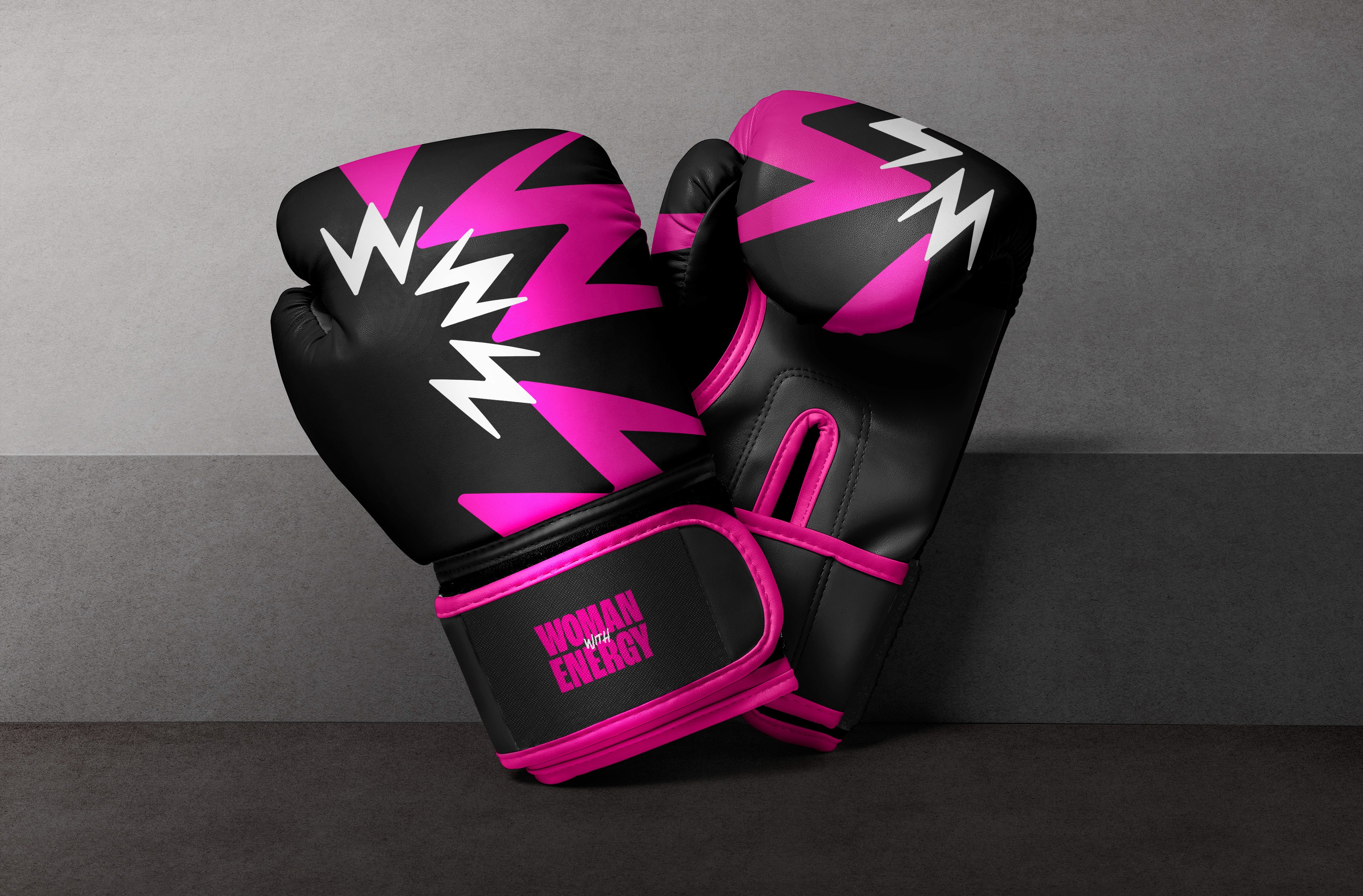
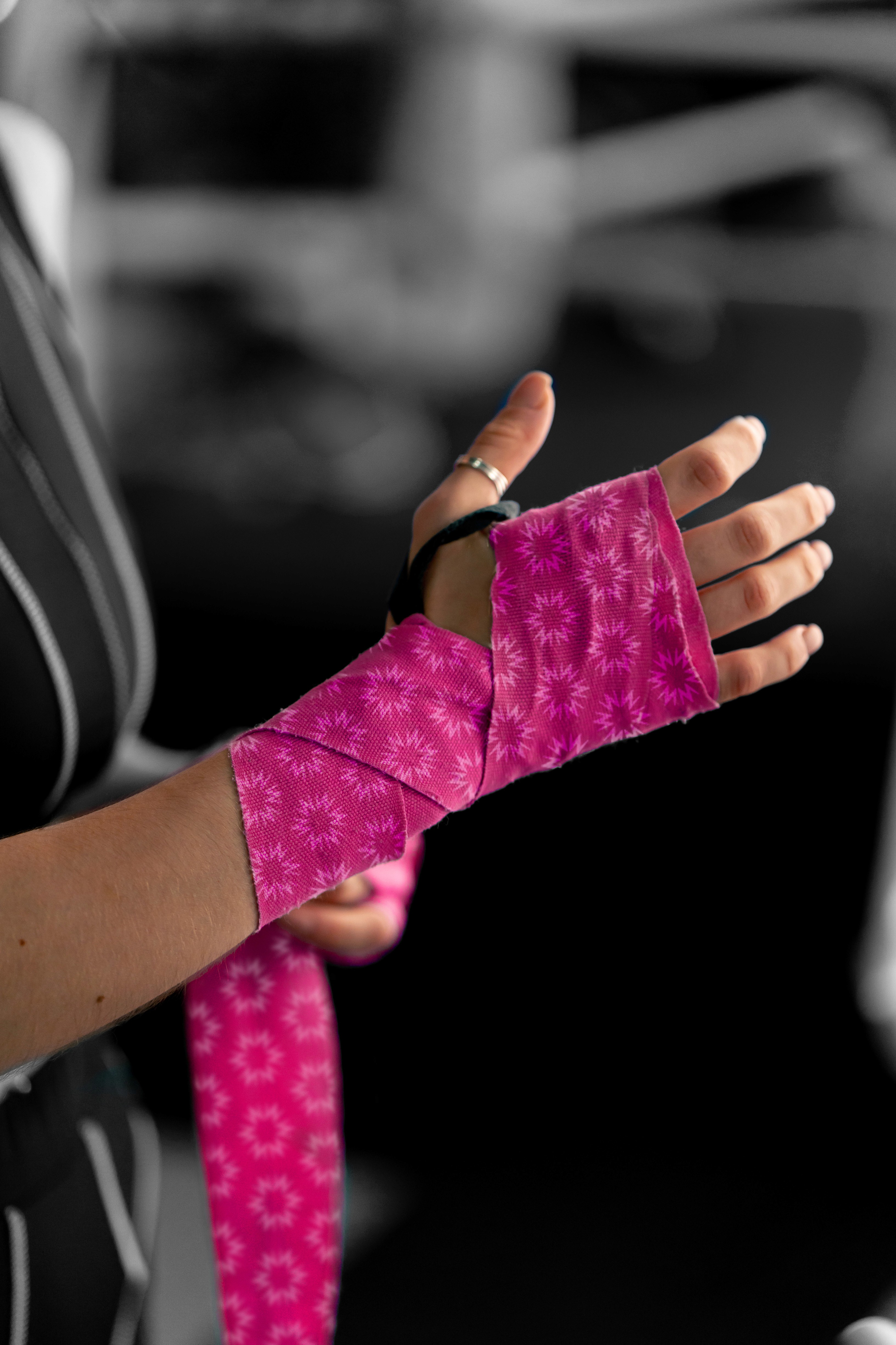
The design came together with bold, electric vibes through the use of hot pink, black, and dynamic shapes that scream power and motion. The typography mixes bold, punchy statements with textured grittiness to keep it real and raw. The messaging is all about lifting each other up while owning your strength. From boxing gloves, apparel, banners, gym gear—the branding made sure to speak to women ready to level up and punch through their limits.