2025
3.OH Energy
Brand Strategy
Logo Identity
Packaging Design
CREDITS
Brand Strategy & Identity Design: Dena Nguyen
Logo Animation: Dana Michelle
About
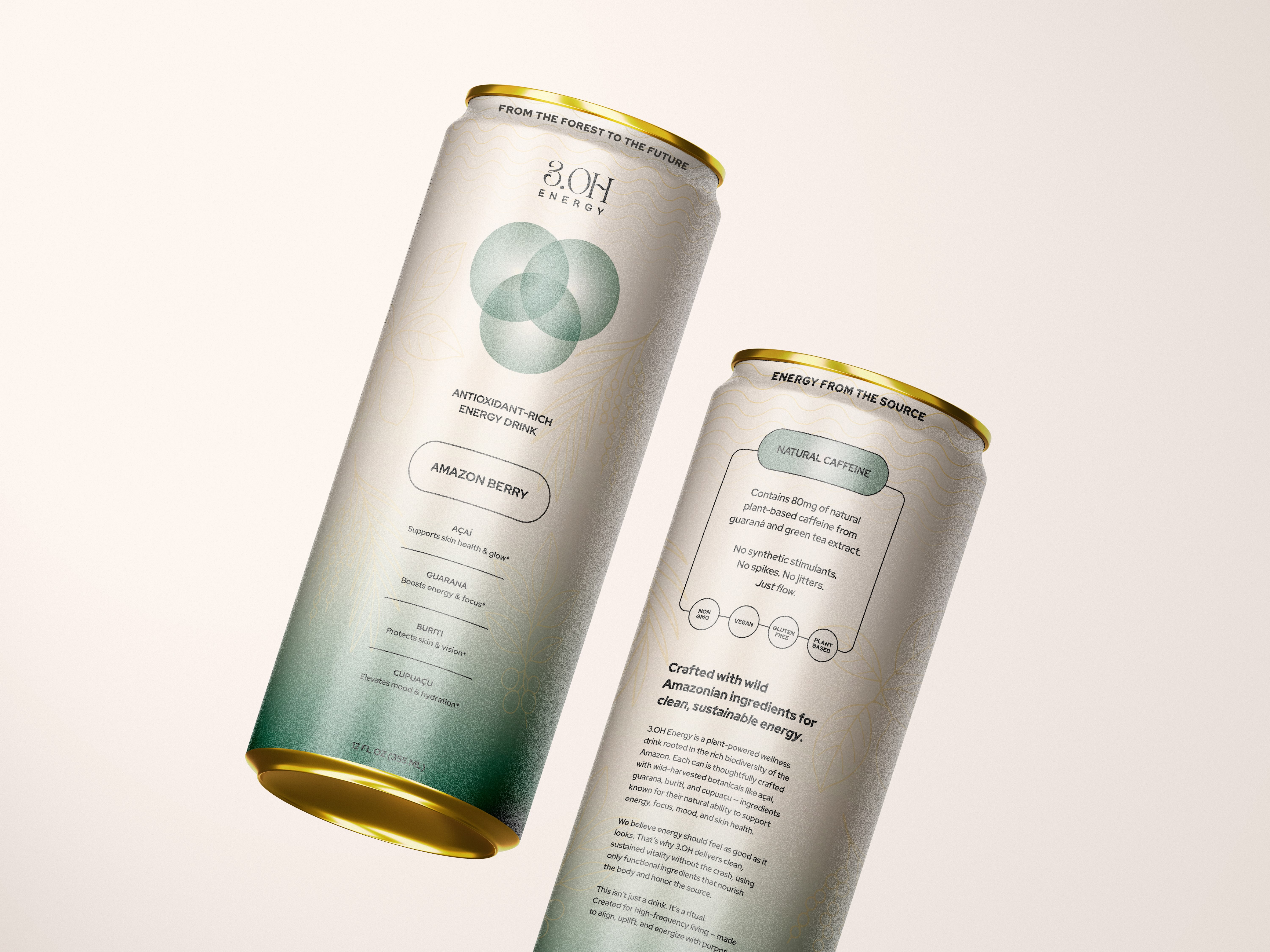
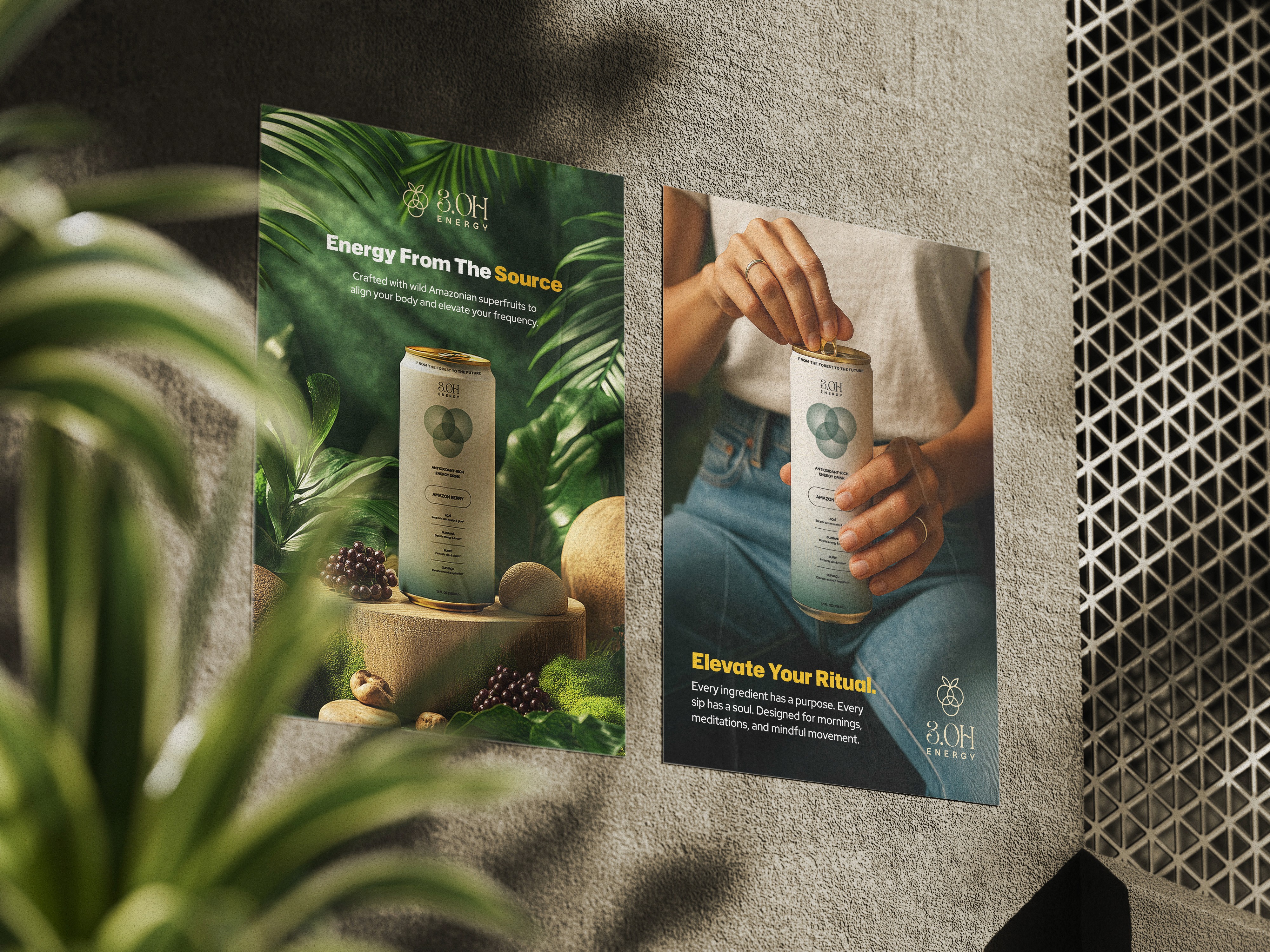
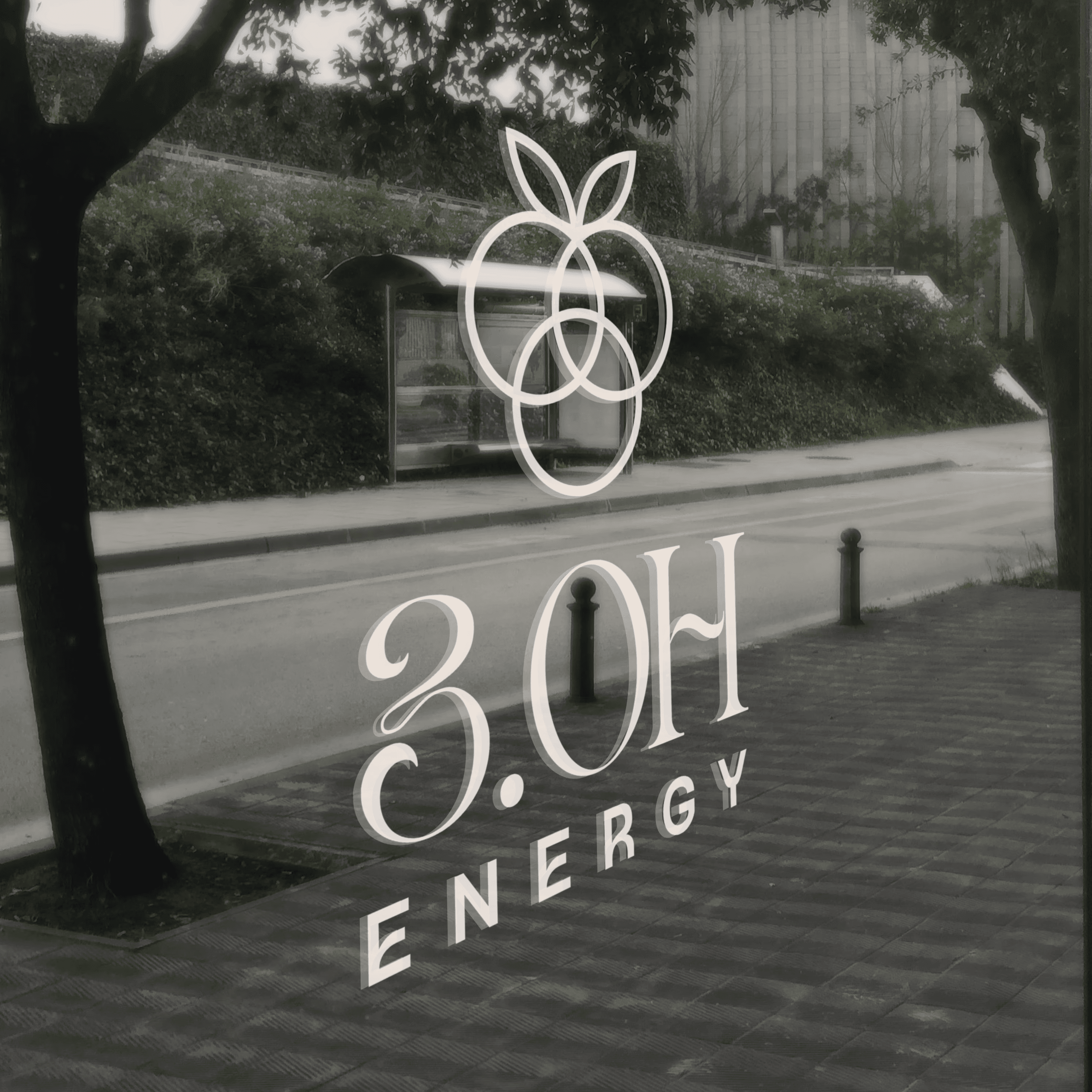
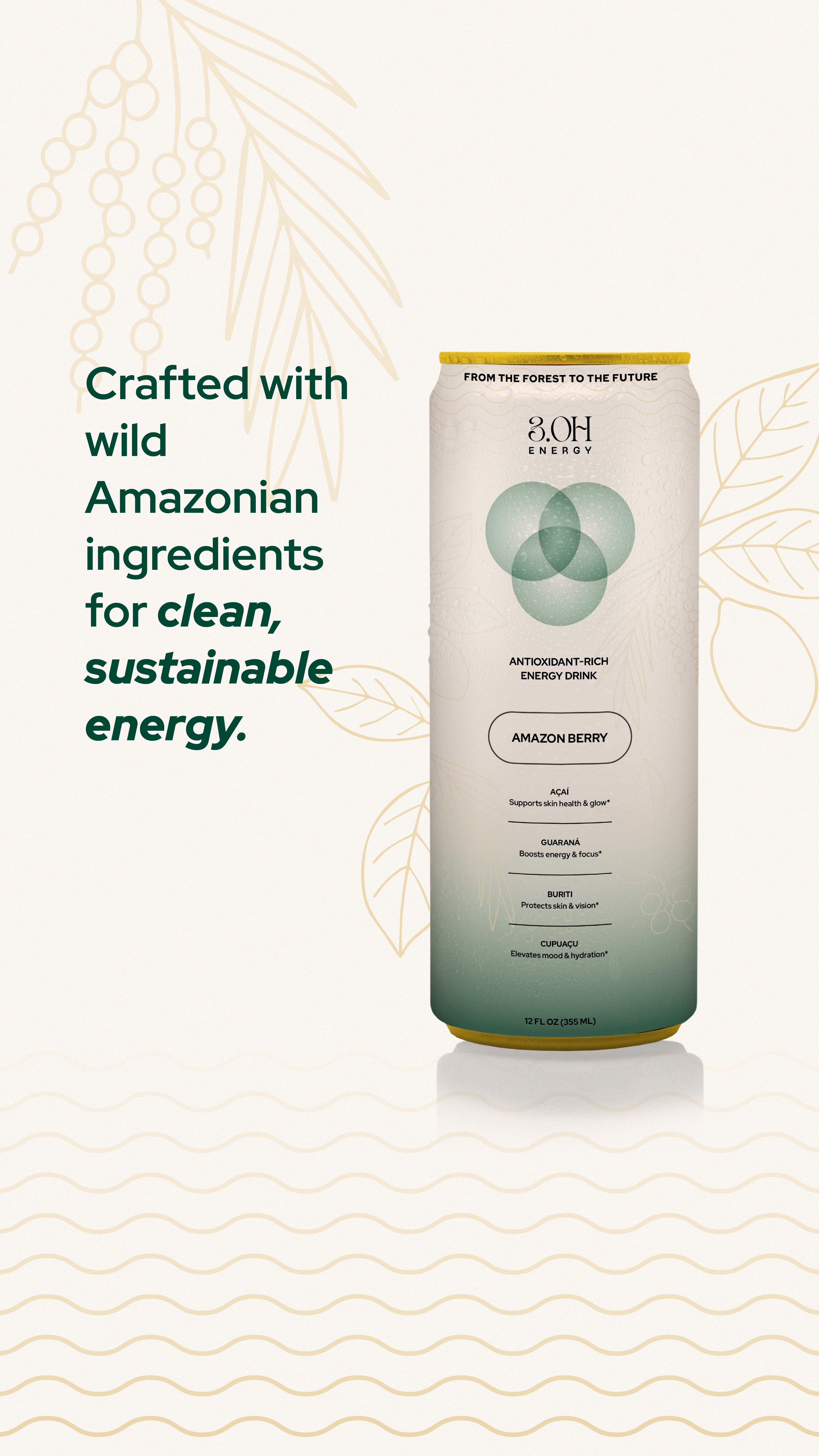
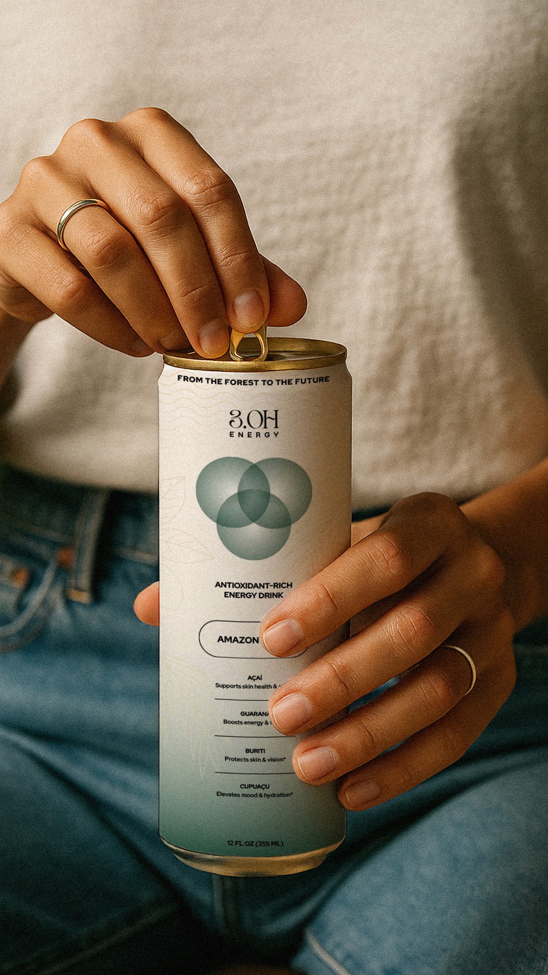
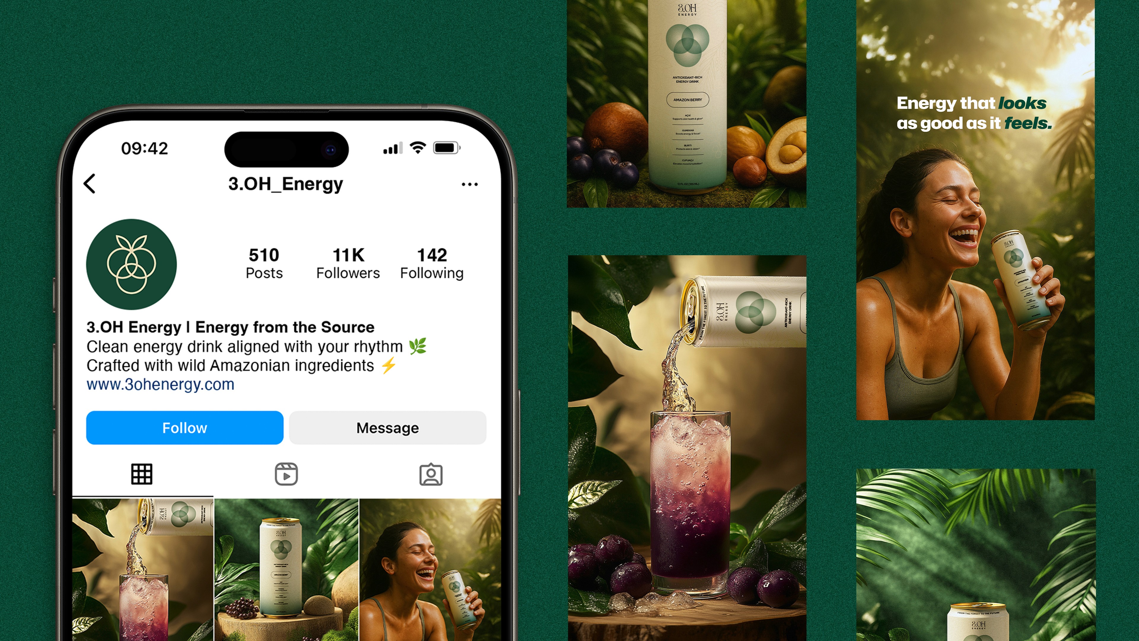
3.0H Energy is an antioxidant energy drink rooted in the biodiversity of the Amazon.
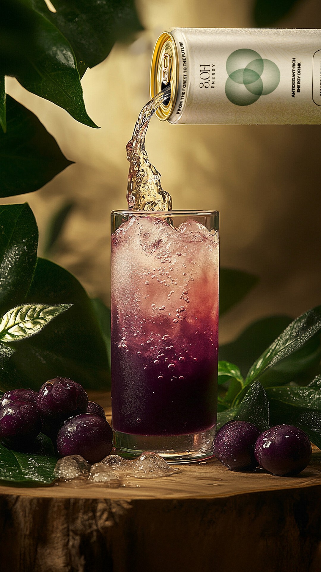
Designed to deliver clean and sustained energy through botanical ingredients, the brand was in need of a full visual identity system & packaging that communicated both function and feeling: modern yet grounded, energizing yet elegant. The goal was to create a brand and packaging system that would resonate with a global, health-conscious audience while remaining authentic to the brand's Amazonian roots.
Problem
The energy drink space is loud and leans heavily on fitness aesthetics or gym culture. 3.OH Energy's old logo and can design was previously created without any strategy or design direction.
In the energy drink market, it's overcrowded with fitness and gym culture, leaving a gap for individuals who care about intentional living, sustainable energy, and natural ingredients. 3.OH Energy was made for the people who care about products that bridge the gap between ancient and modern, are botanically sourced, and reflects a spiritually grounded yet aesthetic design that feels premium without being cold.
Solution
The visual system for 3.OH Energy blends ancestral wisdom with future-forward energy through a refined visual language that feels grounded, intuitive, and elevated.
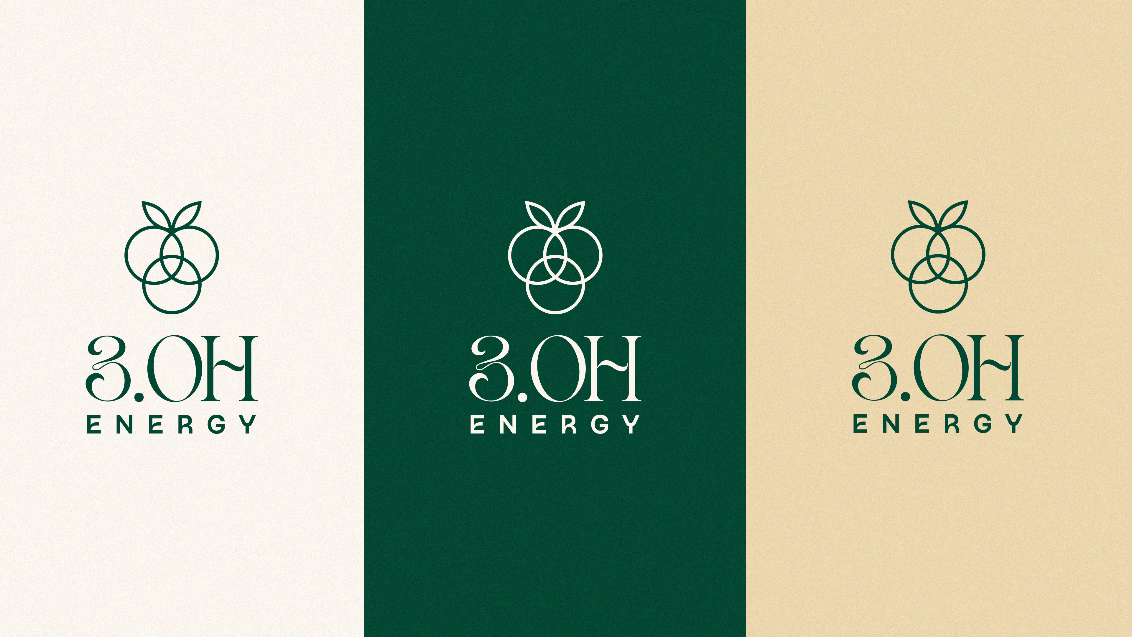
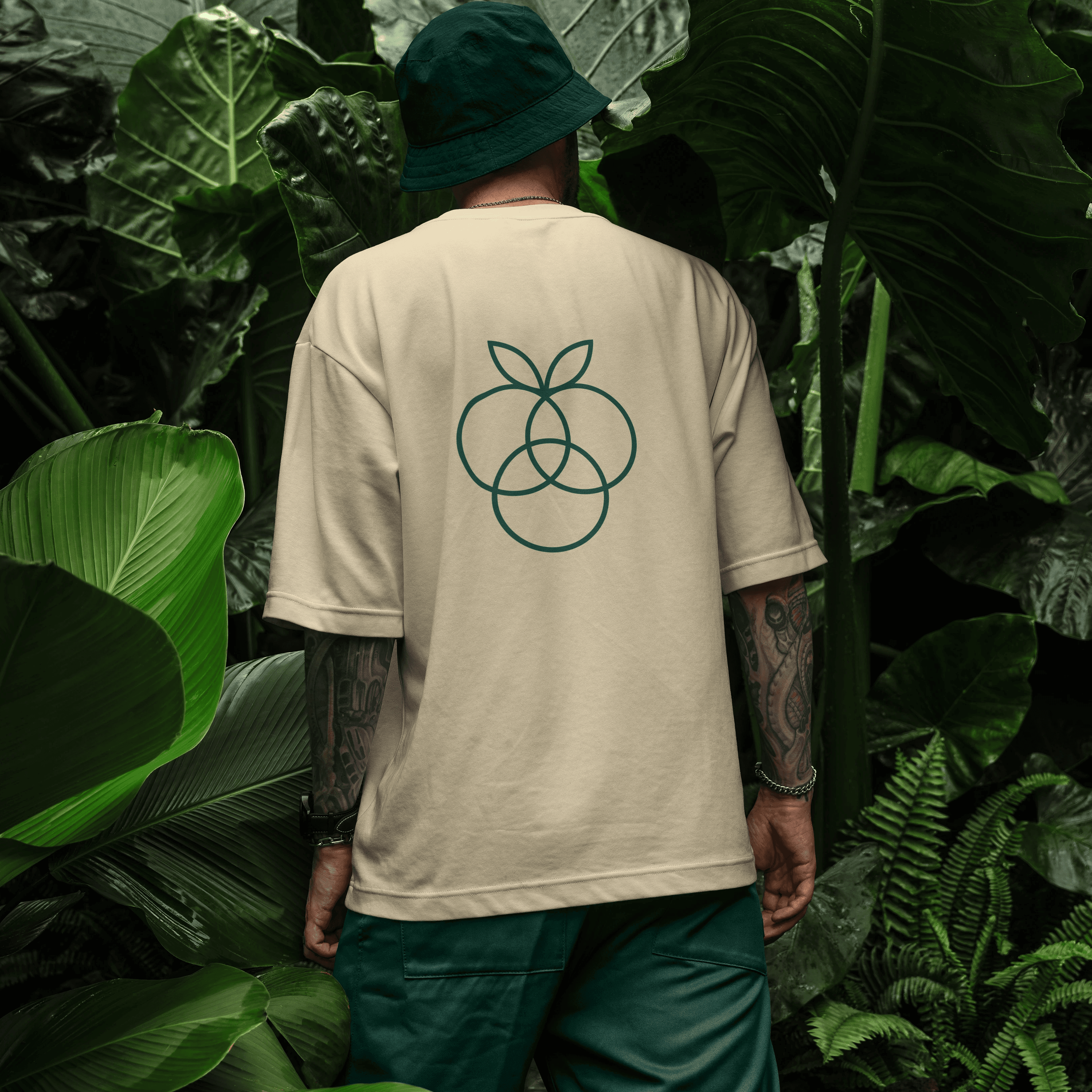
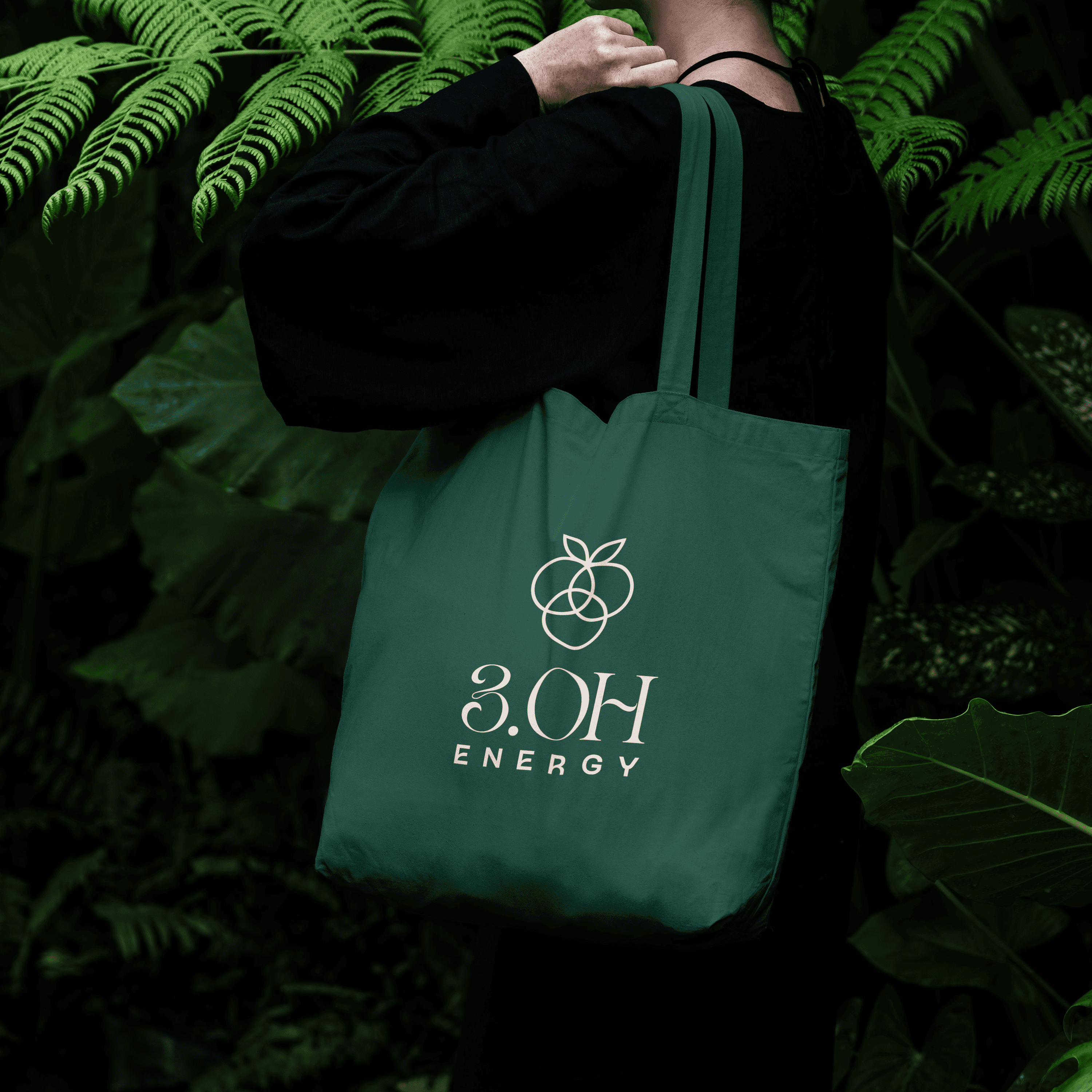
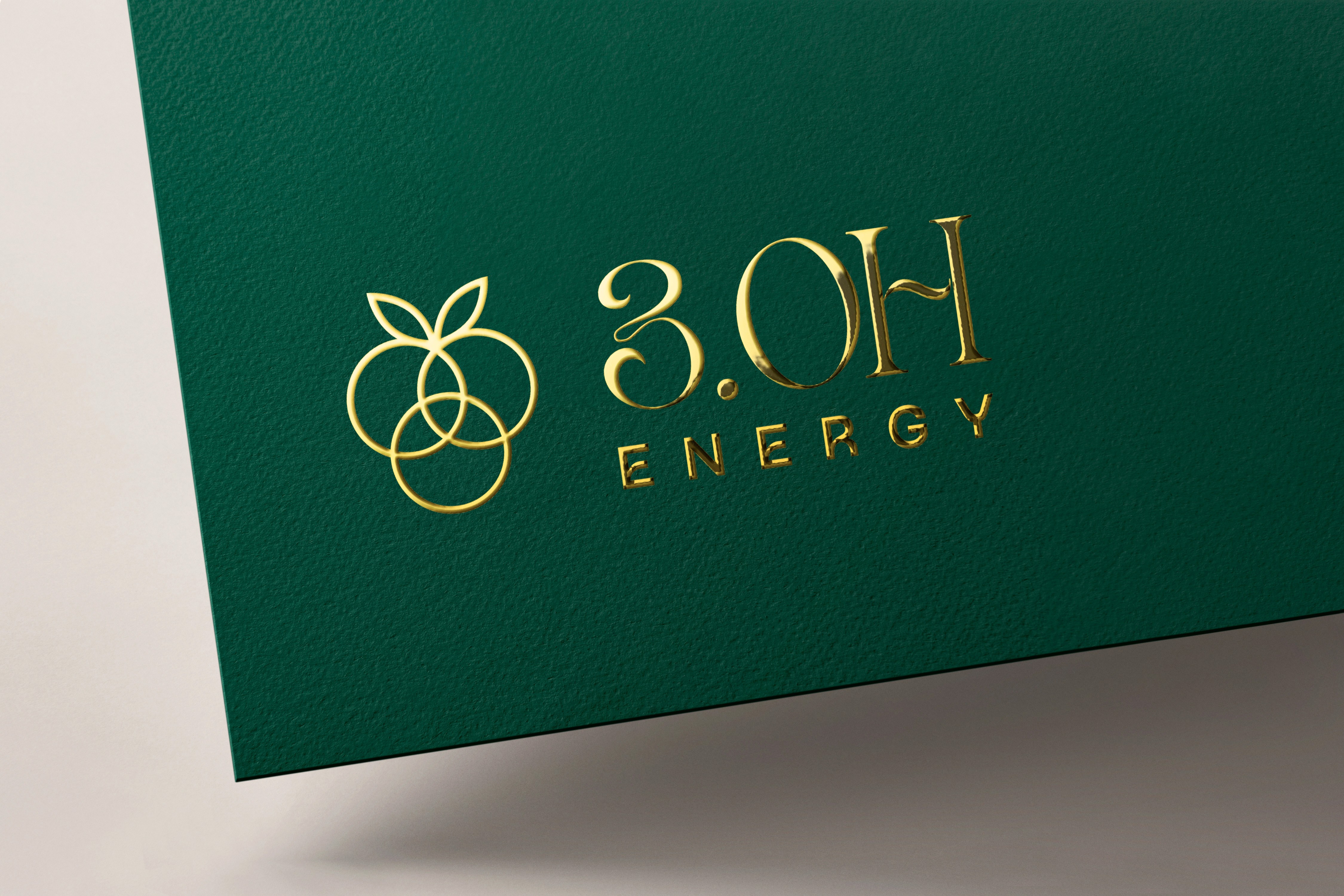
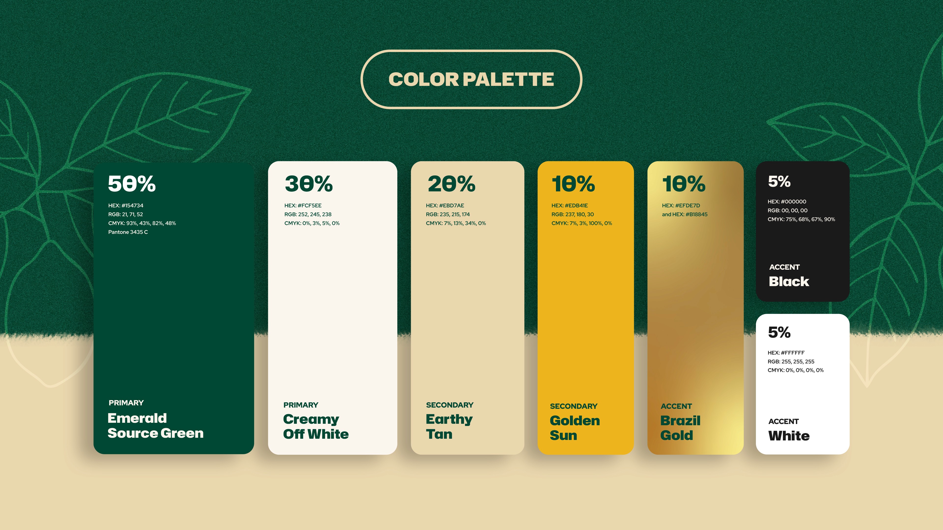
Every creative decision was designed to move beyond trends or hyper-feminine palettes and enters a mature, elegant aesthetic that reflects ritual, energy, and rhythm. The visual system is rooted in the richness of the Amazon rainforest from the earthy color palettes with forest greens, earthy tans, and gold as a premium accent and nod to Brazil, the roots of where the founder is from.
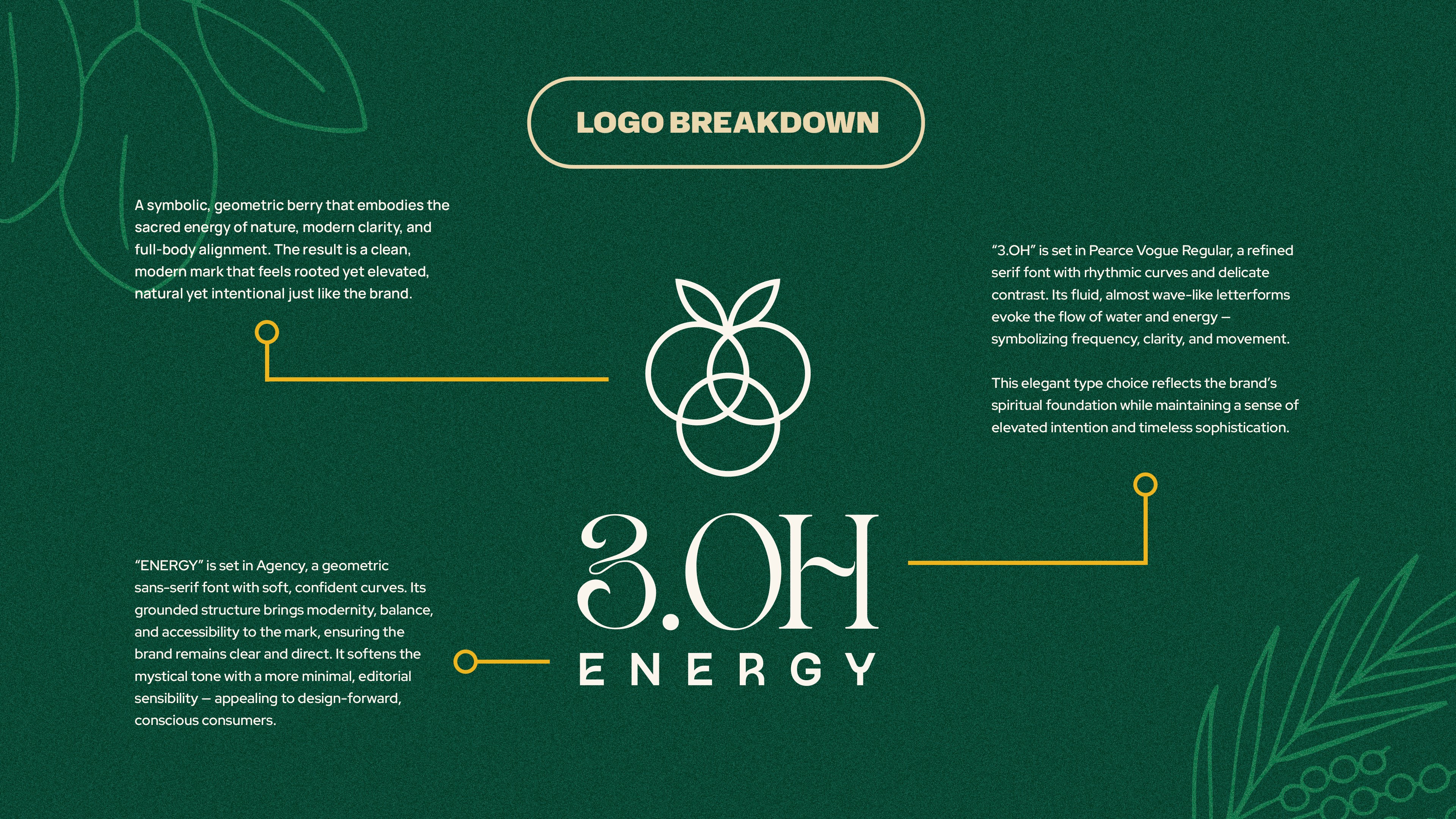
Concept
The brand's slogan is "from the forest to the future", which bridges the gap between the ancient wisdom from the Amazon to the modern, high frequency individual who moves with purpose.
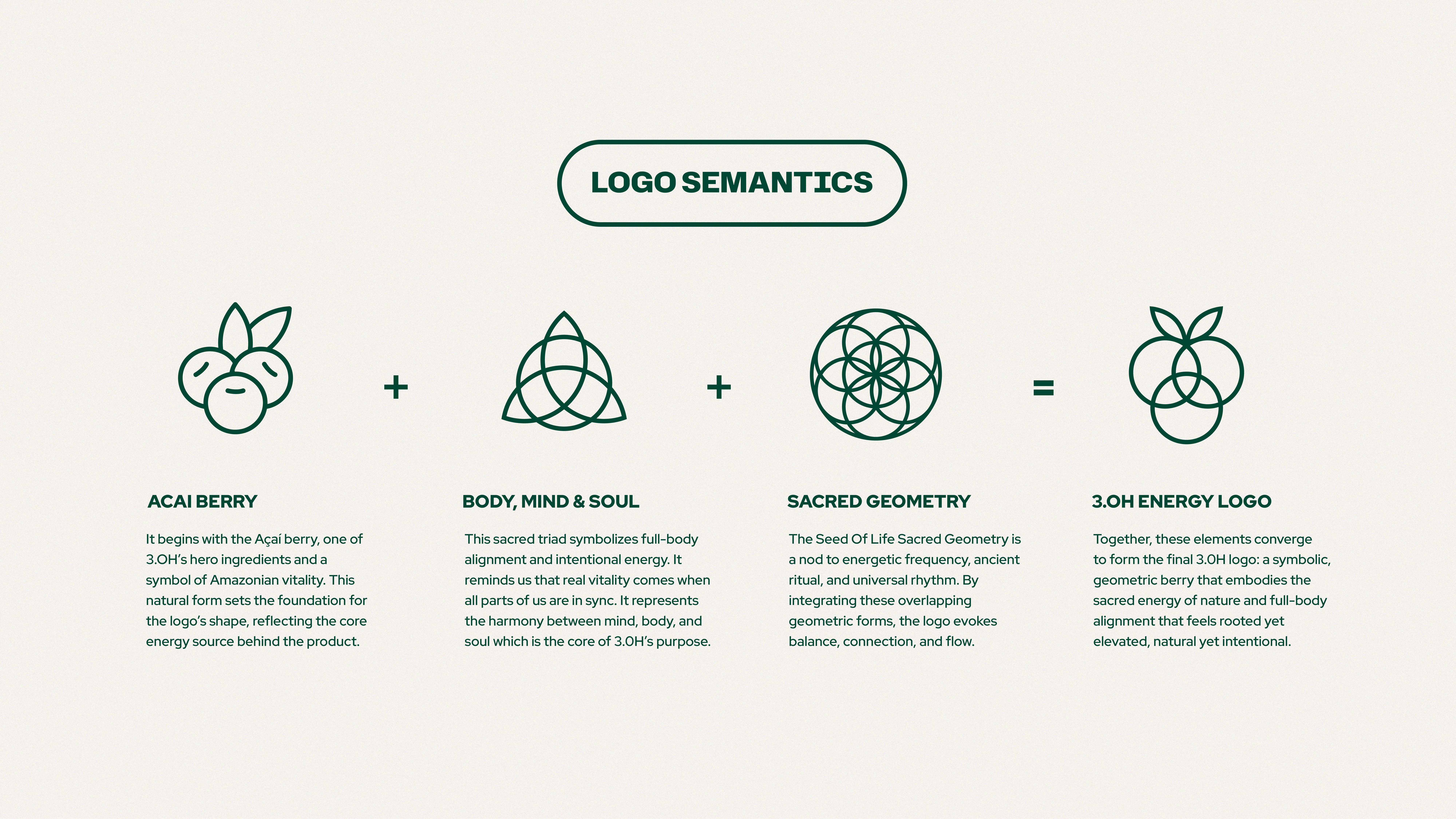
The visual identity system intersects these 2 ideas together based on the brand's archetypes: the Sage (the one who teaches) with the Creator (the one who makes). Together, they balance each other out and create a unique identity that feels spiritual but not alienating, grounded and intentional.
PROJECTS
MORE WORK

NUROX
Brand Strategy
Logo Identity
Packaging Design
NUROX
Brand Strategy
Logo Identity
Packaging Design

Lulley
Brand Strategy
Logo Identity
Packaging Design
Lulley
Brand Strategy
Logo Identity
Packaging Design

The Double Happiness Co
Brand Strategy
Logo Identity
Packaging Design
The Double Happiness Co
Brand Strategy
Logo Identity
Packaging Design

Village (Coming Soon)
Brand Strategy
Logo Identity
Packaging Design
Village (Coming Soon)
Brand Strategy
Logo Identity
Packaging Design
Casabe Paul (Coming Soon)
Brand Strategy
Logo Identity
Packaging Design
Casabe Paul (Coming Soon)
Brand Strategy
Logo Identity
Packaging Design
2025
3.OH Energy
Brand Strategy
Logo Identity
Packaging Design
CREDITS
Brand Strategy & Identity Design: Dena Nguyen
Logo Animation: Dana Michelle
About
3.0H Energy is an antioxidant energy drink rooted in the biodiversity of the Amazon.
Designed to deliver clean and sustained energy through botanical ingredients, the brand was in need of a full visual identity system & packaging that communicated both function and feeling: modern yet grounded, energizing yet elegant. The goal was to create a brand and packaging system that would resonate with a global, health-conscious audience while remaining authentic to the brand's Amazonian roots.
Problem
The energy drink space is loud and leans heavily on fitness aesthetics or gym culture. 3.OH Energy's old logo and can design was previously created without any strategy or design direction.
In the energy drink market, it's overcrowded with fitness and gym culture, leaving a gap for individuals who care about intentional living, sustainable energy, and natural ingredients. 3.OH Energy was made for the people who care about products that bridge the gap between ancient and modern, are botanically sourced, and reflects a spiritually grounded yet aesthetic design that feels premium without being cold.
Solution
The visual system for 3.OH Energy blends ancestral wisdom with future-forward energy through a refined visual language that feels grounded, intuitive, and elevated.
Every creative decision was designed to move beyond trends or hyper-feminine palettes and enters a mature, elegant aesthetic that reflects ritual, energy, and rhythm. The visual system is rooted in the richness of the Amazon rainforest from the earthy color palettes with forest greens, earthy tans, and gold as a premium accent and nod to Brazil, the roots of where the founder is from.
Concept
The brand's slogan is "from the forest to the future", which bridges the gap between the ancient wisdom from the Amazon to the modern, high frequency individual who moves with purpose.
The visual identity system intersects these 2 ideas together based on the brand's archetypes: the Sage (the one who teaches) with the Creator (the one who makes). Together, they balance each other out and create a unique identity that feels spiritual but not alienating, grounded and intentional.
PROJECTS
MORE WORK