2024
Lulley
Brand Strategy
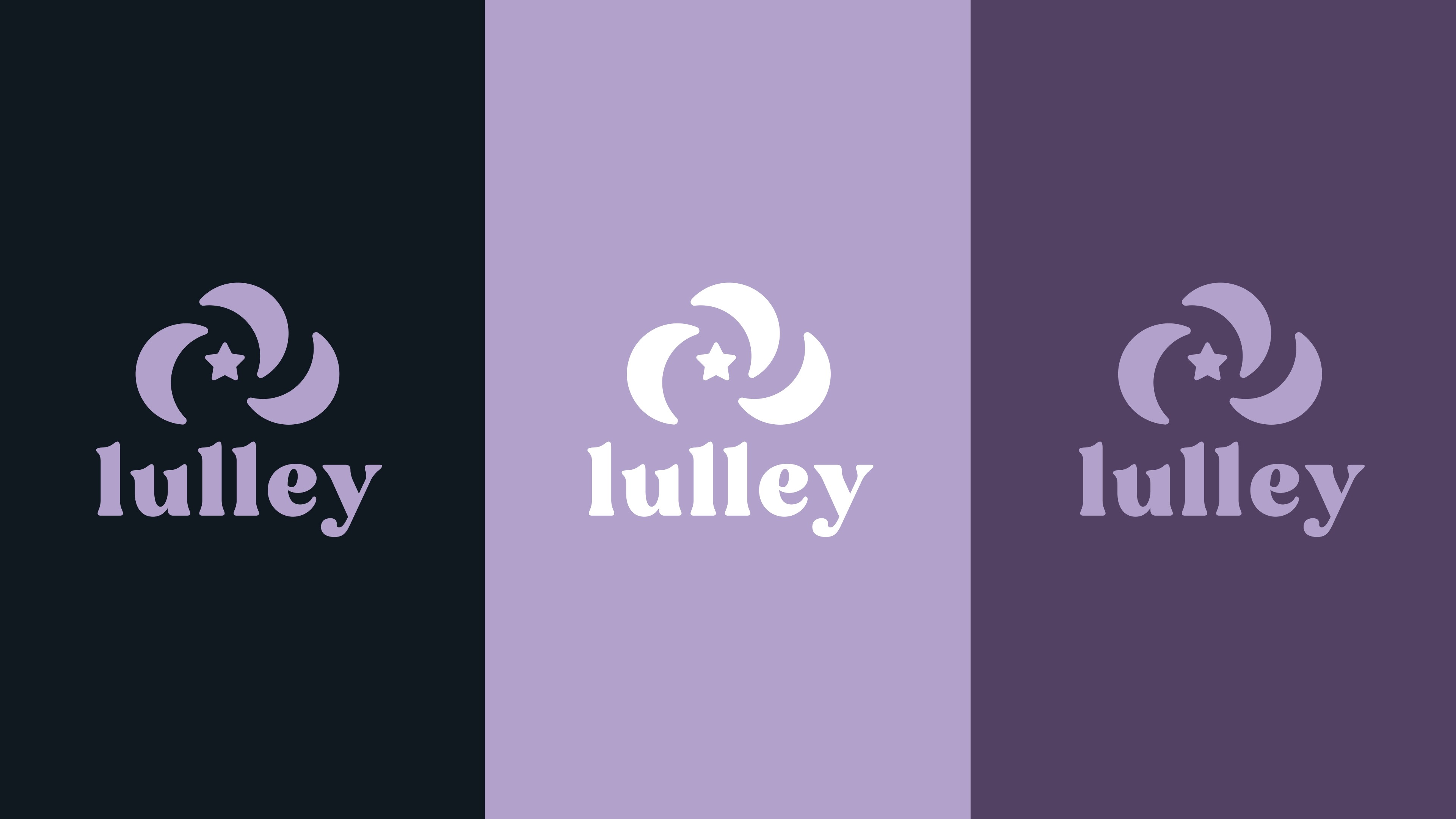
Logo Identity
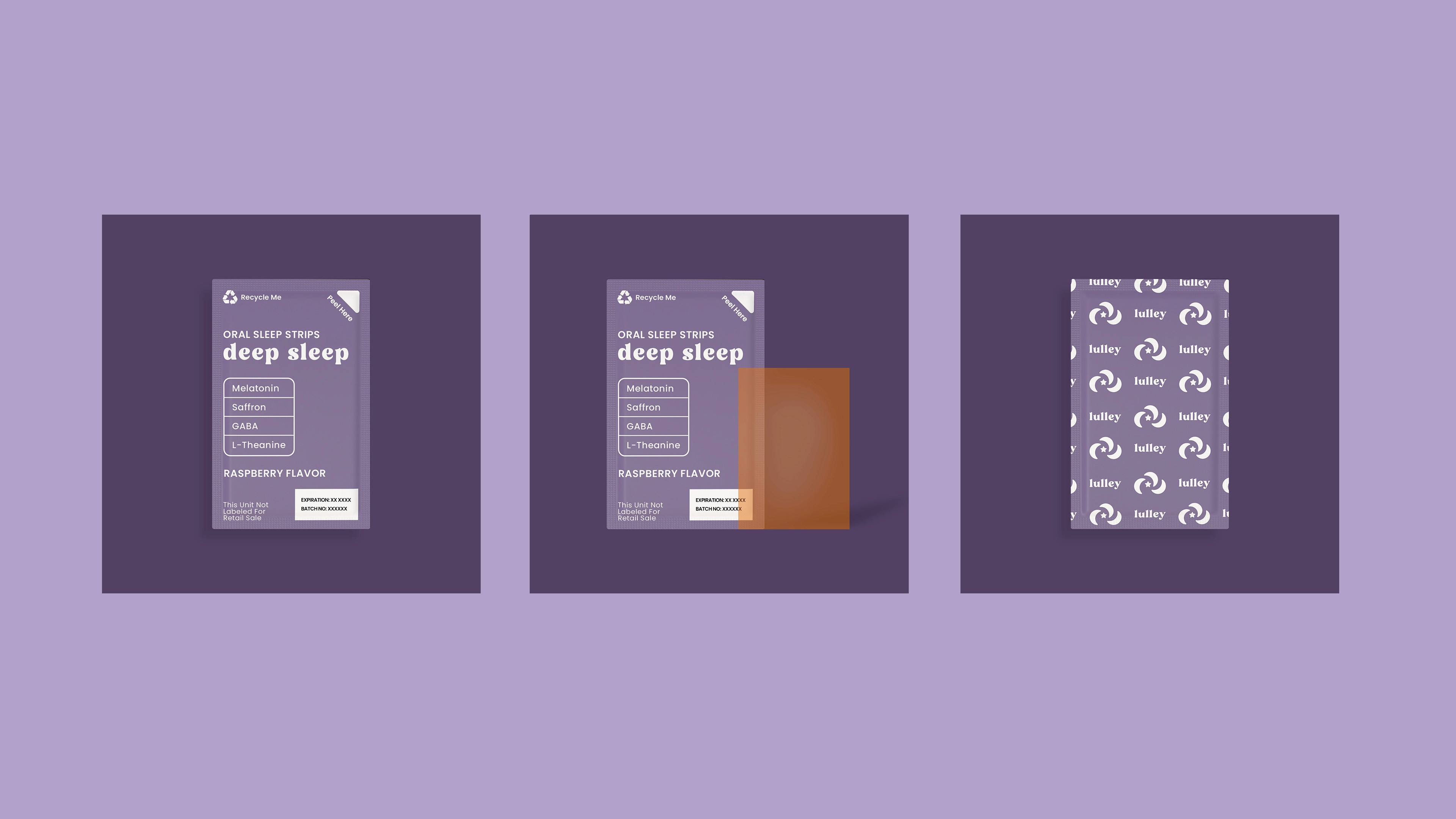
Packaging Design
CREDITS
Brand Strategy & Identity Design: Dena Nguyen
Logo Animation: Dana Michelle
About
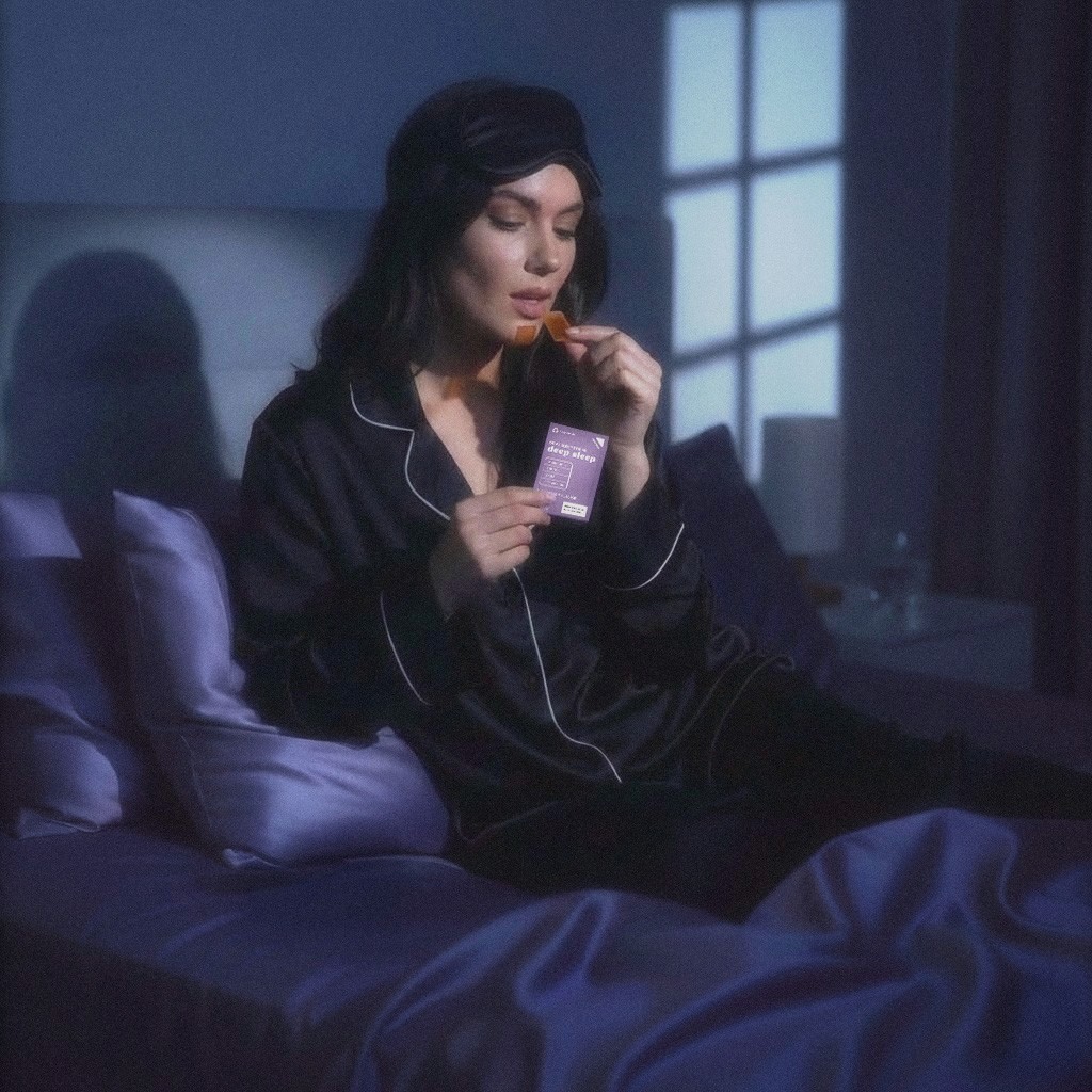
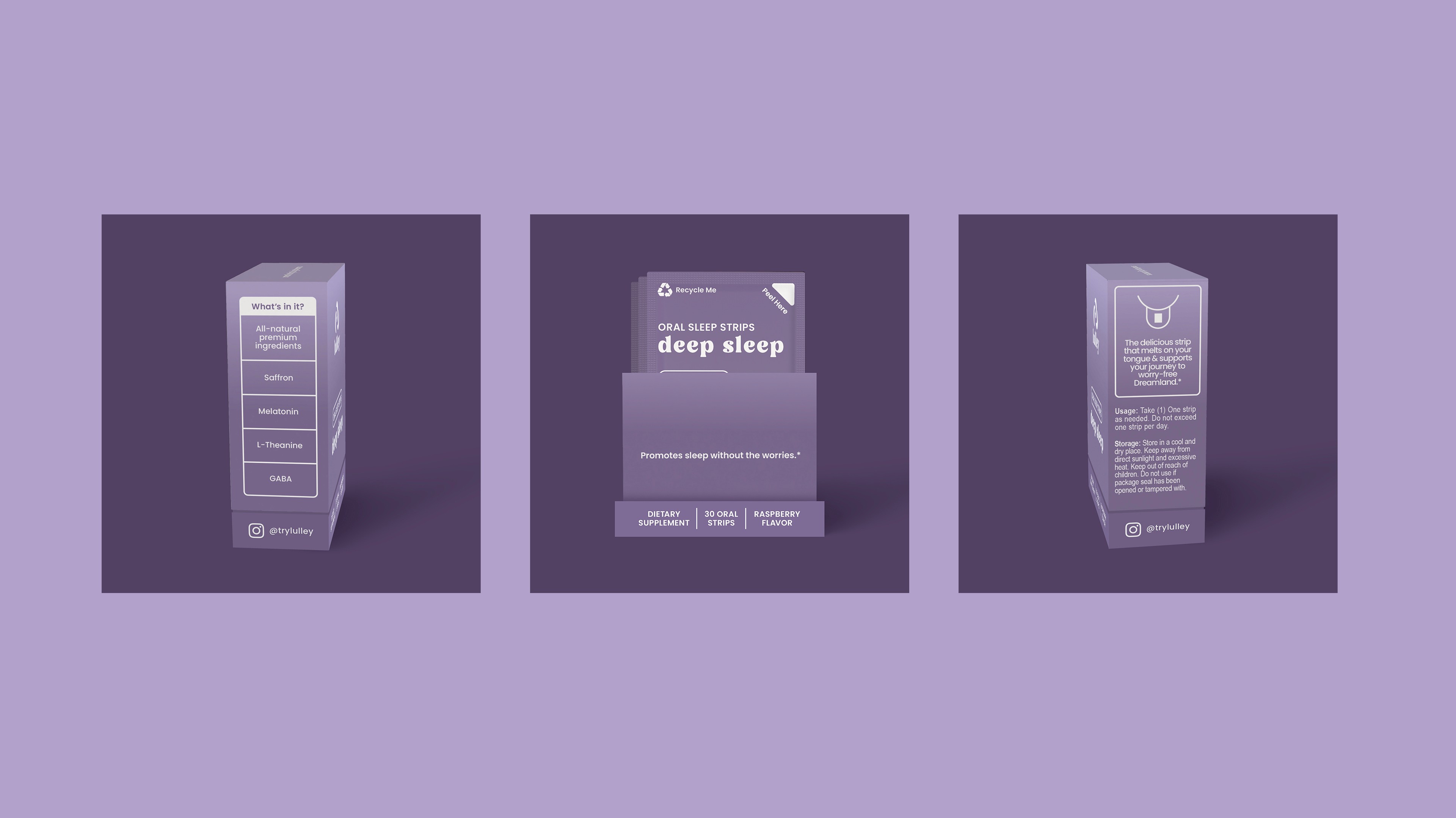
Lulley is a dissolvable sleep strip designed to help individuals relax their minds and drift into peaceful sleep.
These sleep strips makes falling asleep effortless for people who have trouble sleeping. The dissolvable strip format makes it quick and easy to absorb in the body within 15 minutes (faster than sleeping pills, gummies, or drinks).
Problem
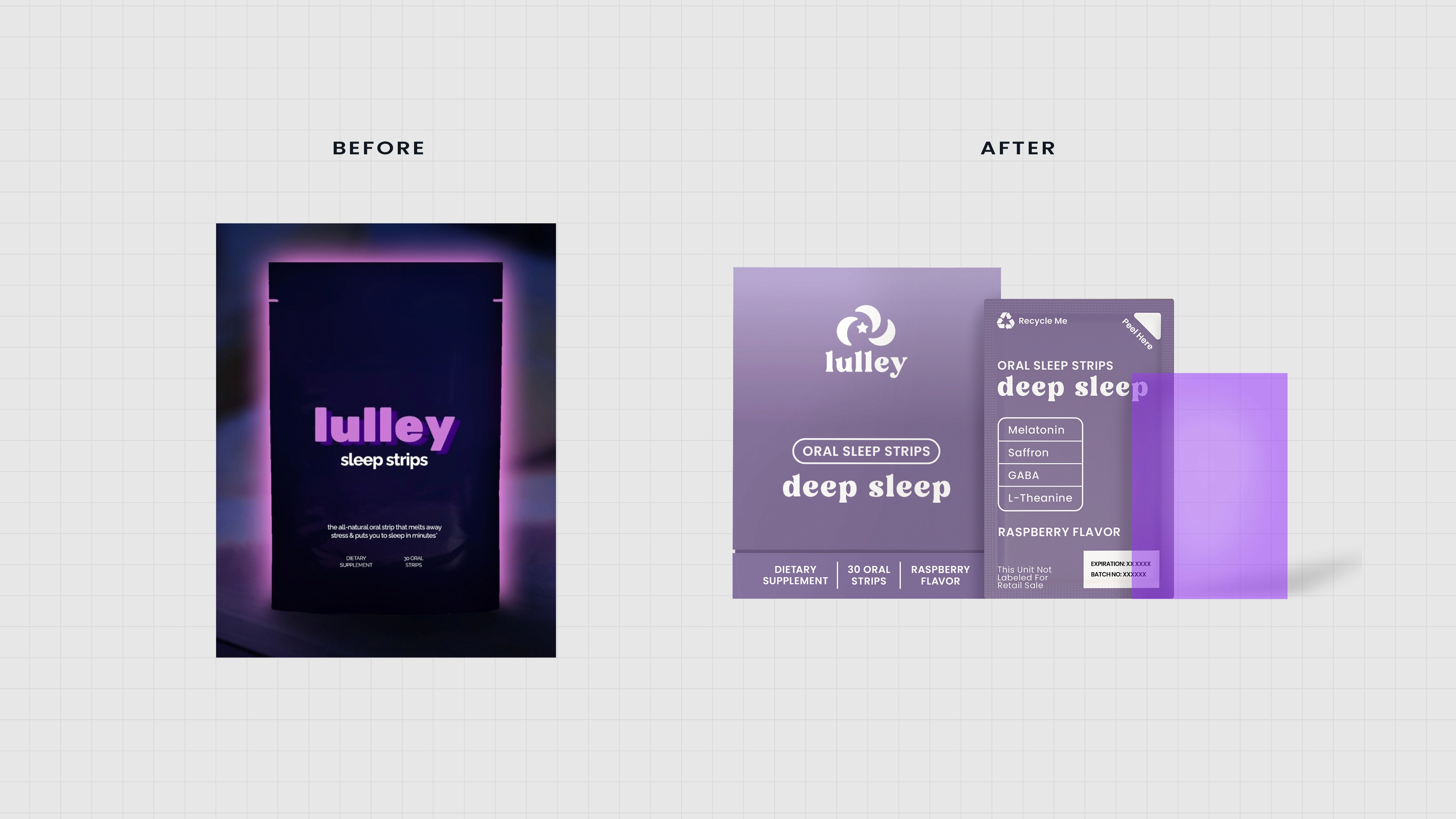
Lulley’s previous logo and packaging design was generic, unmemorable, and not positioned to attract the right people.
The brand’s visuals was dark and almost suspicious looking. You couldn’t tell what the product was and it didn’t feel trustworthy due to a lack of clarity in positioning and design direction.

Solution
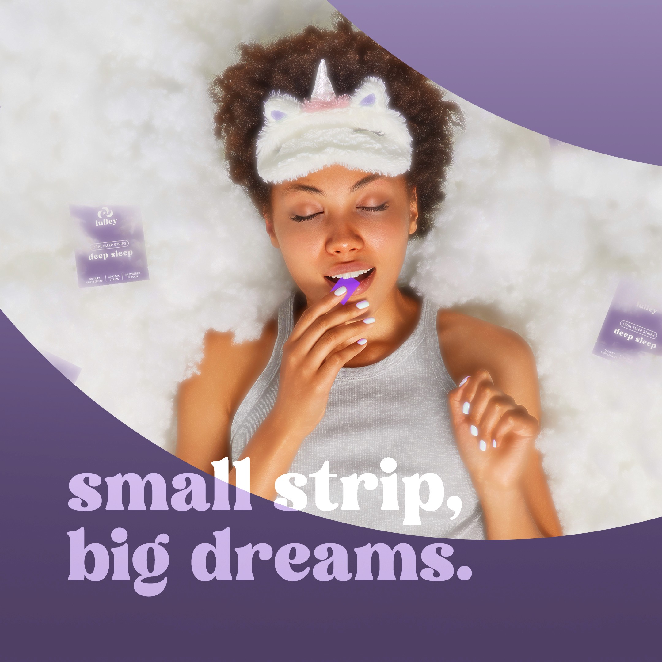
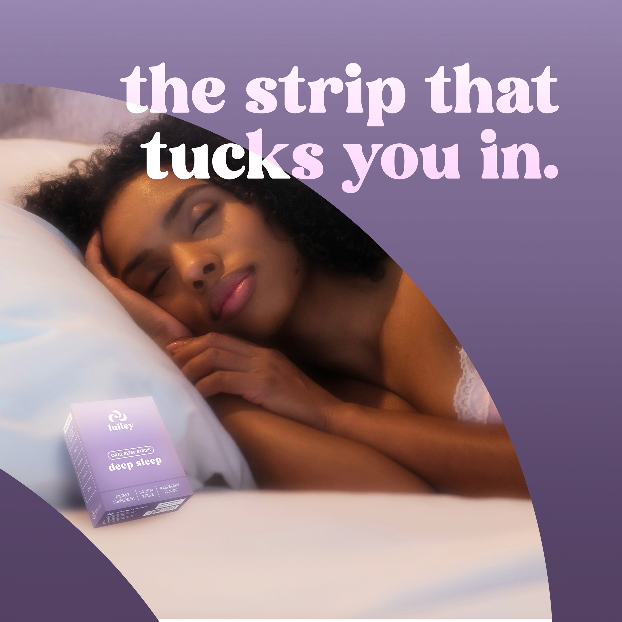
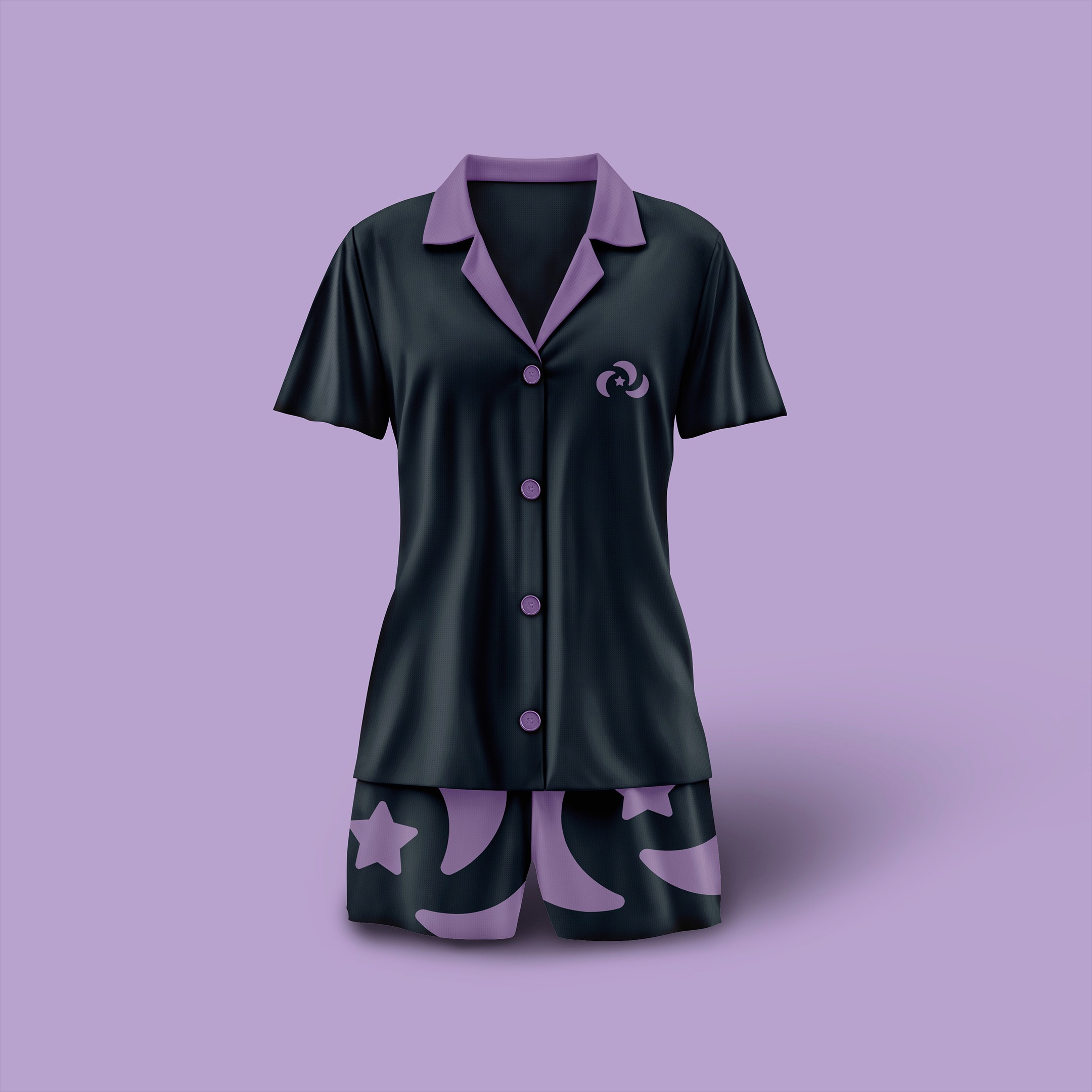
Rebrand and reposition Lulley as a modern, calm self-care ritual designed brand for Gen Z and Milennial female consumers.
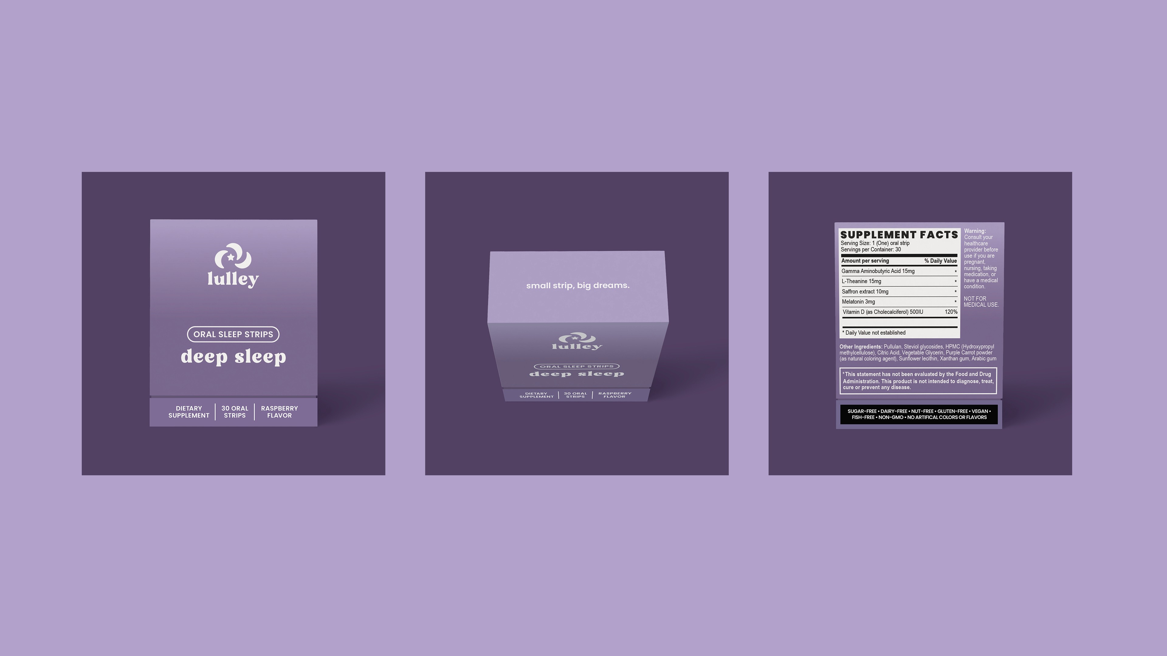
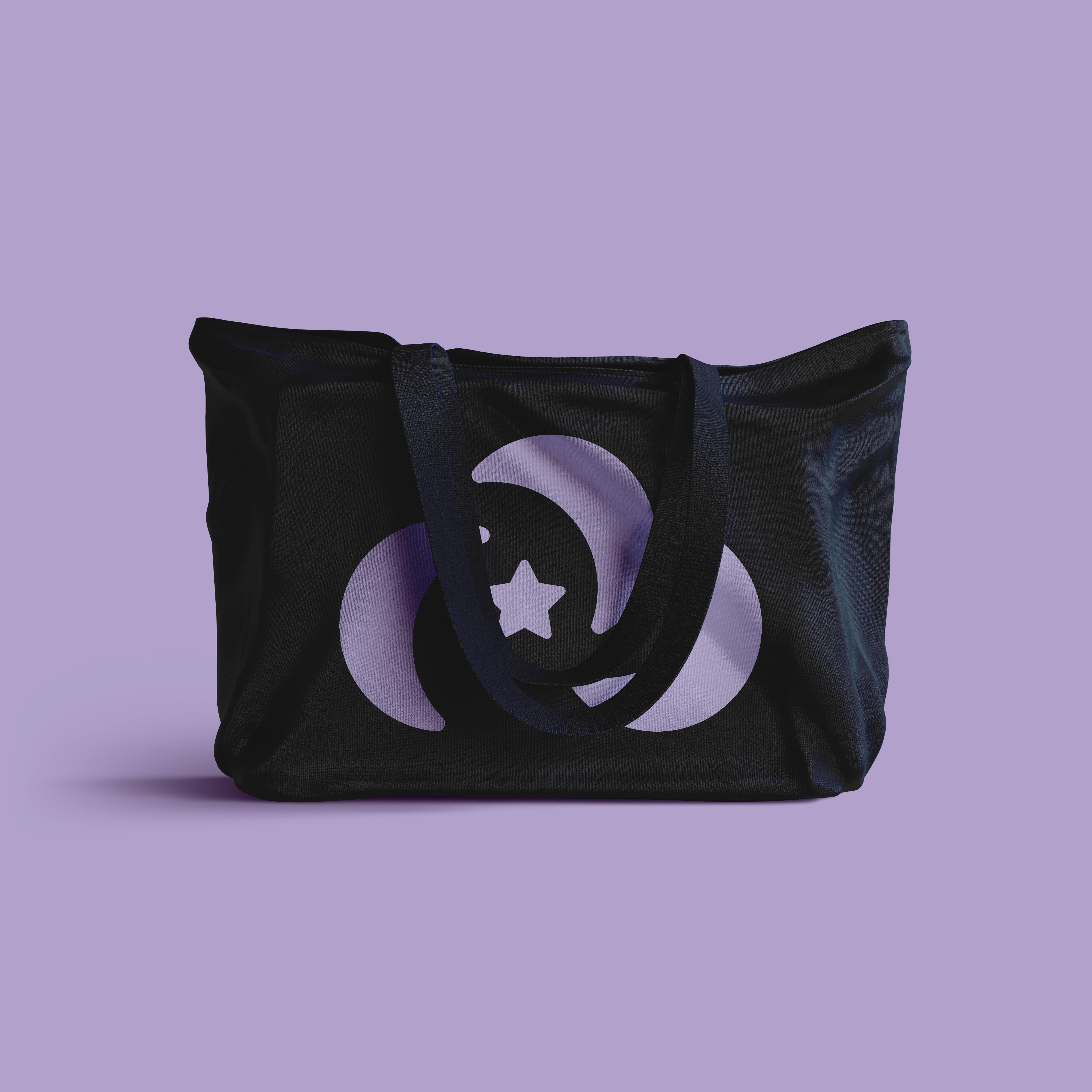
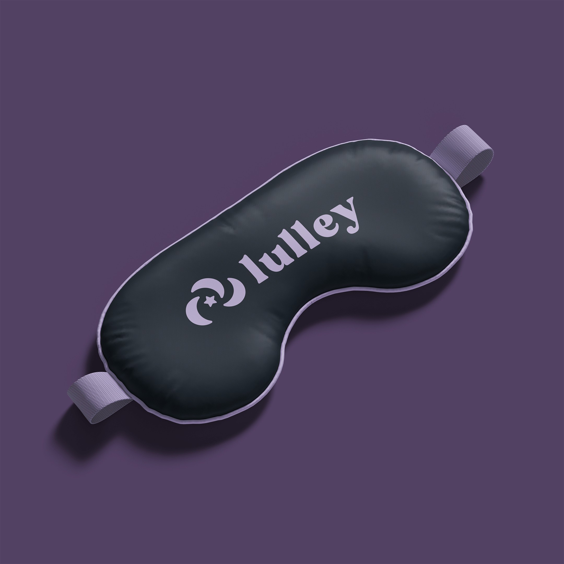
We repositioned the brand’s strategy and designed an identity that was rooted in emotional connection and visual clarity, reflecting calm, clarity, and care. It was designed to feel reassuring, relatable, and trustworthy so people can feel confident taking a strip before they drift off into sleep. The packaging format updated from a glossy seal pouch to a unique matte box, positioning the brand as more modern, premium, and convenient for travel.
Concept
The creative direction was redesigned with dreamy lavender gradients, clean slab serif typography, and a minimalist layout to evoke peace, clarity, and ease-of-use.
The layout was simple with clear benefits, ingredient visibility, and gentle user prompts that were added to build trust and encourage daily use. This revamp of the brand's strategy and visual identity repositioned Lulley to feel calm, credible, and fully aligned with their audience.


PROJECTS
MORE WORK

NUROX
Brand Strategy
Logo Identity
Packaging Design
NUROX
Brand Strategy
Logo Identity
Packaging Design

3.OH Energy
Brand Strategy
Logo Identity
Packaging Design
3.OH Energy
Brand Strategy
Logo Identity
Packaging Design

The Double Happiness Co
Brand Strategy
Logo Identity
Packaging Design
The Double Happiness Co
Brand Strategy
Logo Identity
Packaging Design
Village (Coming Soon)
Brand Strategy
Logo Identity
Packaging Design
Village (Coming Soon)
Brand Strategy
Logo Identity
Packaging Design
Casabe Paul (Coming Soon)
Brand Strategy
Logo Identity
Packaging Design
Casabe Paul (Coming Soon)
Brand Strategy
Logo Identity
Packaging Design
2024
Lulley
Brand Strategy
Logo Identity
Packaging Design
CREDITS
Brand Strategy & Identity Design: Dena Nguyen
Logo Animation: Dana Michelle
About
Lulley is a dissolvable sleep strip designed to help individuals relax their minds and drift into peaceful sleep.
These sleep strips makes falling asleep effortless for people who have trouble sleeping. The dissolvable strip format makes it quick and easy to absorb in the body within 15 minutes (faster than sleeping pills, gummies, or drinks).
Problem
Lulley’s previous logo and packaging design was generic, unmemorable, and not positioned to attract the right people.
The brand’s visuals was dark and almost suspicious looking. You couldn’t tell what the product was and it didn’t feel trustworthy due to a lack of clarity in positioning and design direction.
Solution
Rebrand and reposition Lulley as a modern, calm self-care ritual designed brand for Gen Z and Milennial female consumers.
We repositioned the brand’s strategy and designed an identity that was rooted in emotional connection and visual clarity, reflecting calm, clarity, and care. It was designed to feel reassuring, relatable, and trustworthy so people can feel confident taking a strip before they drift off into sleep. The packaging format updated from a glossy seal pouch to a unique matte box, positioning the brand as more modern, premium, and convenient for travel.
Concept
The creative direction was redesigned with dreamy lavender gradients, clean slab serif typography, and a minimalist layout to evoke peace, clarity, and ease-of-use.
The layout was simple with clear benefits, ingredient visibility, and gentle user prompts that were added to build trust and encourage daily use. This revamp of the brand's strategy and visual identity repositioned Lulley to feel calm, credible, and fully aligned with their audience.
PROJECTS
MORE WORK
NUROX
Brand Strategy
Logo Identity
Packaging Design
3.OH Energy
Brand Strategy
Logo Identity
Packaging Design
The Double Happiness Co
Brand Strategy
Logo Identity
Packaging Design
Village (Coming Soon)
Brand Strategy
Logo Identity
Packaging Design
Casabe Paul (Coming Soon)
Brand Strategy
Logo Identity
Packaging Design