2025
The Double Happiness Co
Brand Strategy
Logo Identity
Stationary Design
CREDITS
Brand Strategy & Identity Design: Dena Nguyen
Logo Animation: Dana Michelle
ABOUT
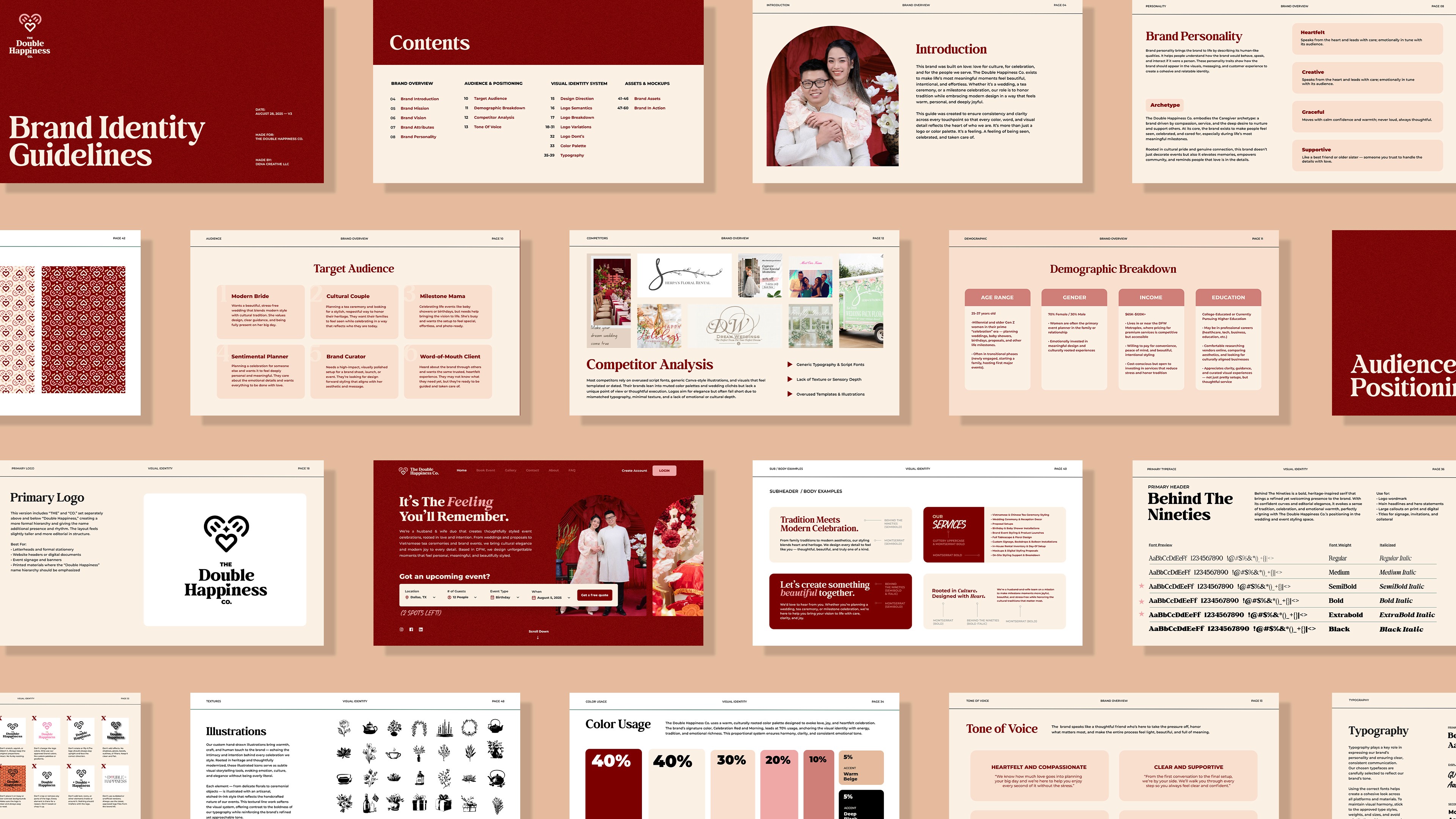
The Double Happiness Co. is an event styling & decor brand that specializes in tea ceremonies, weddings, and milestone celebrations.
Founded by a husband and wife duo, they're a small but mighty team who cares about intention styling rooted in culture and joy. As their business was expanding, so were their needs for branding.
Problem
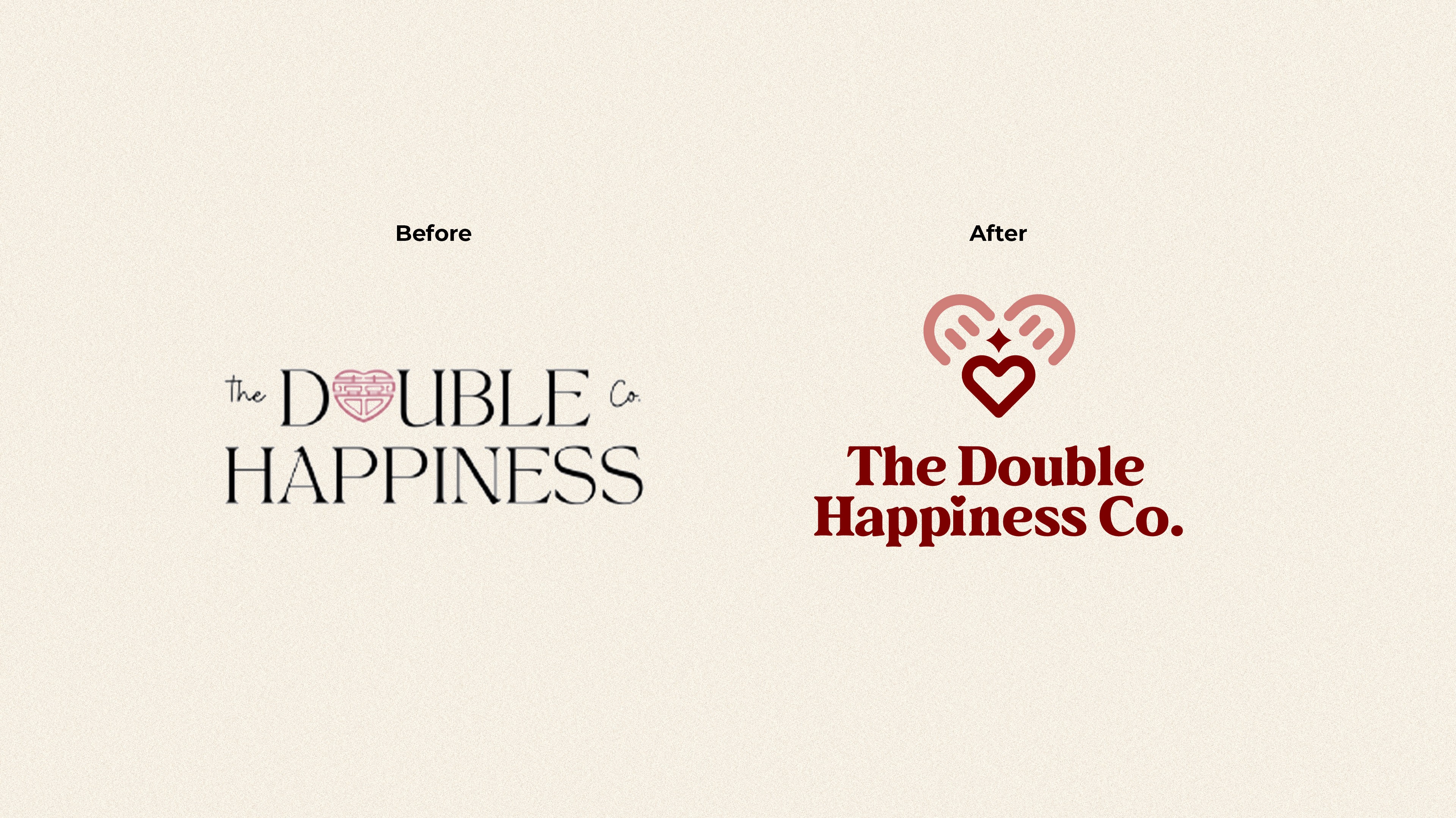
Their previous logo was not scalable, felt outdated, and didn't reflect where they were heading towards.
Most event styling businesses follow the same design blueprint: cliché wedding aesthetics with hard-to-read cursive and thin serif fonts with old money aesthetics. They made it clear that they didn't want to blend in or follow this blueprint.
Another issue was that although they specialized in Vietnamese tea ceremonies, they didn't want to be boxed in or feel culturally limiting. The brand had to feel more welcoming to anyone planning a meaningful celebration and serve a more broad audience. The logo had to be a timeless, iconic mark that could stand alone.
Solution
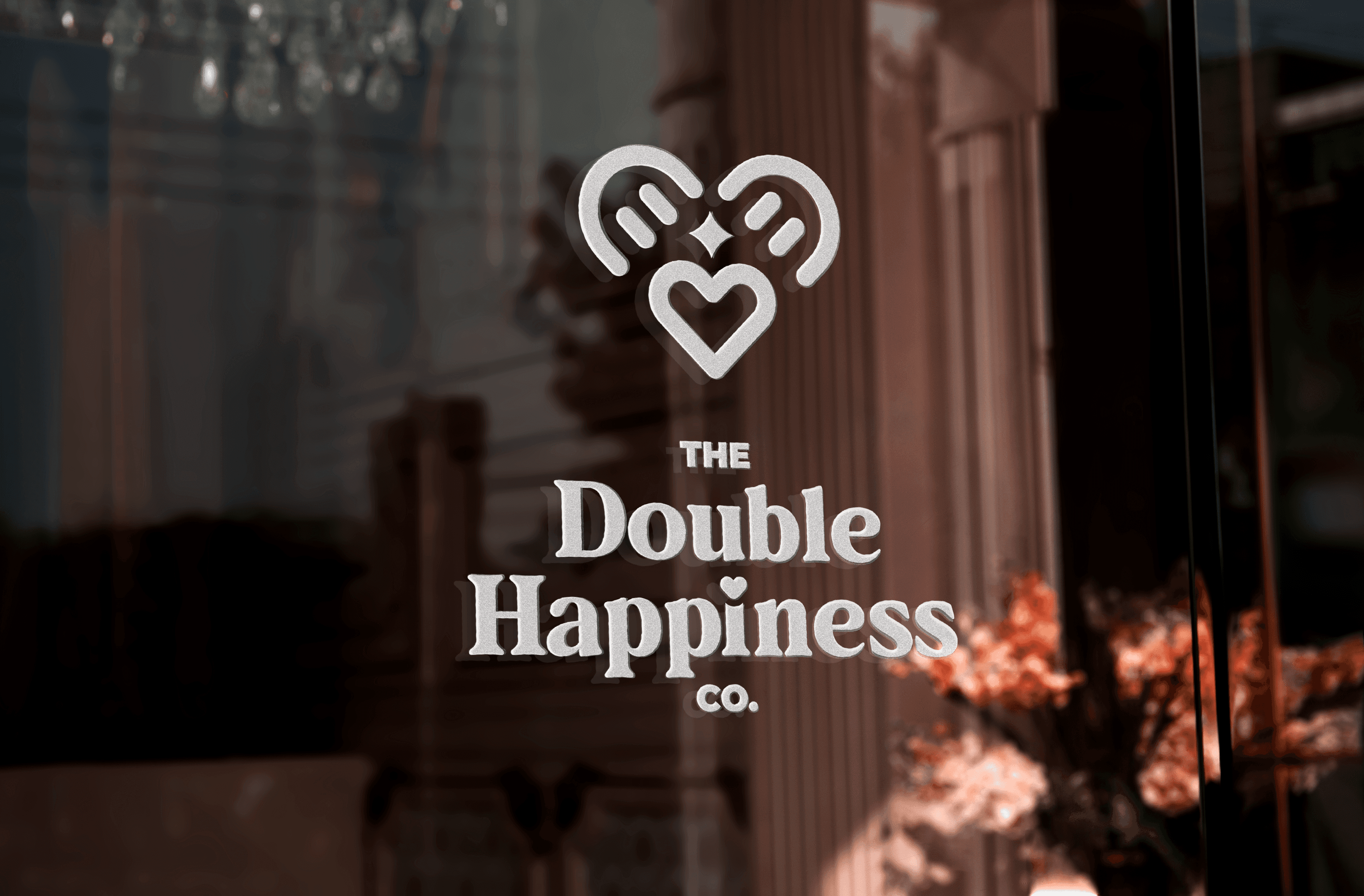
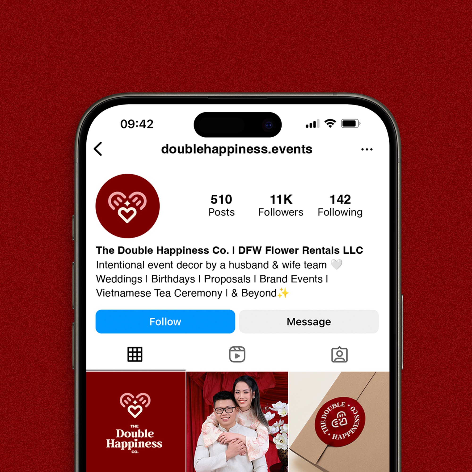
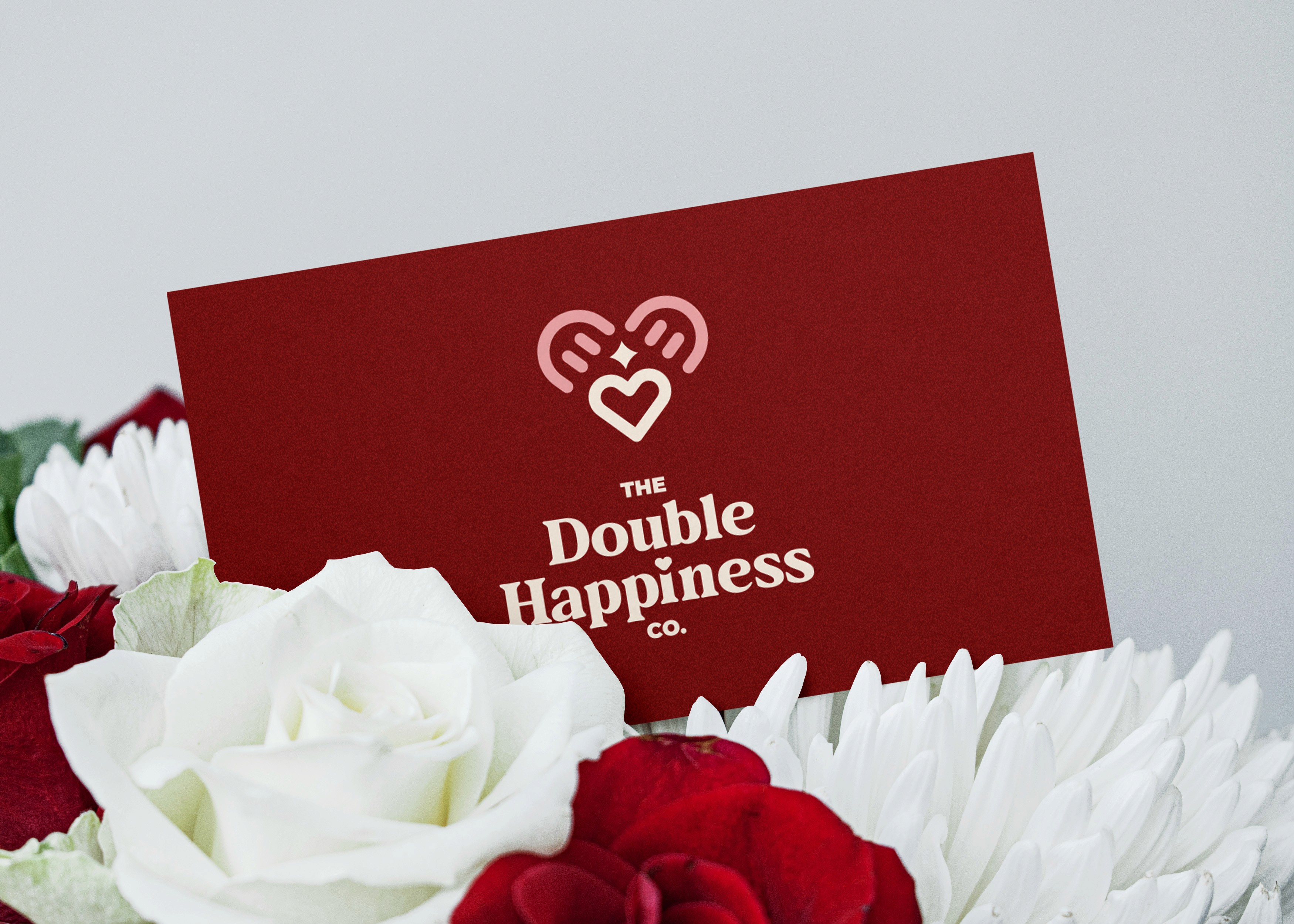
A timeless, scalable visual identity that's rooted in joy, happiness, and love.
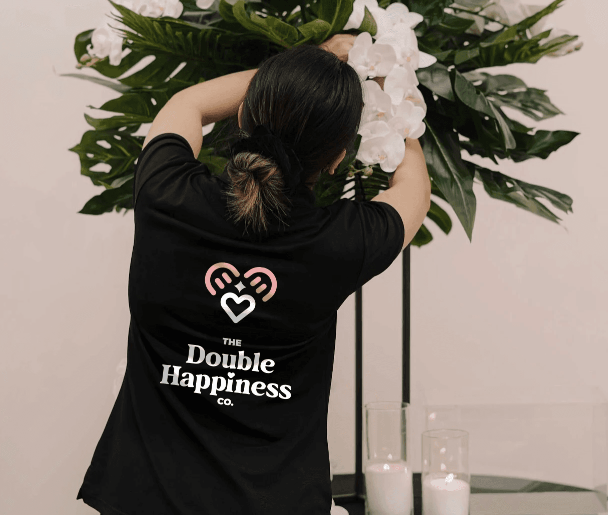
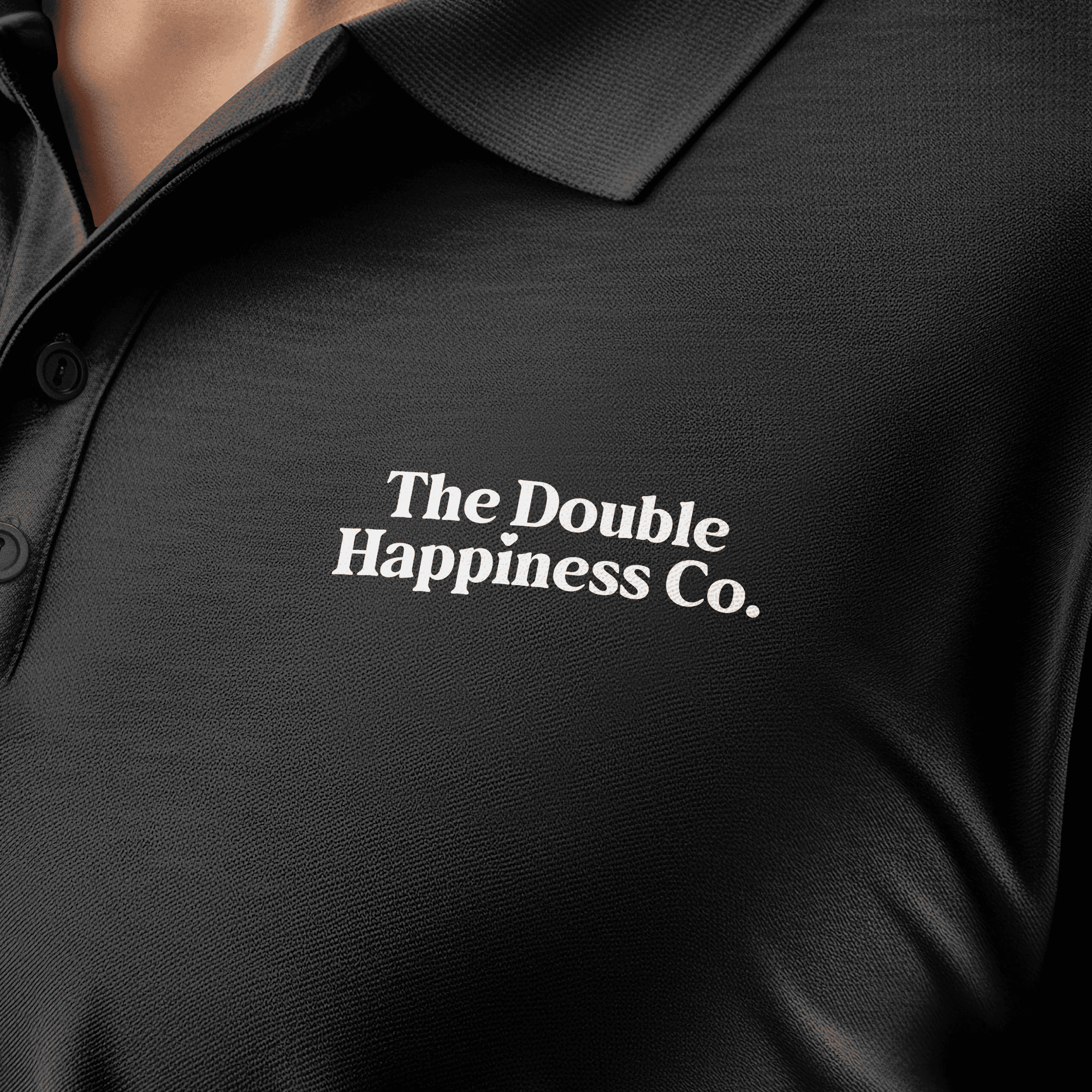
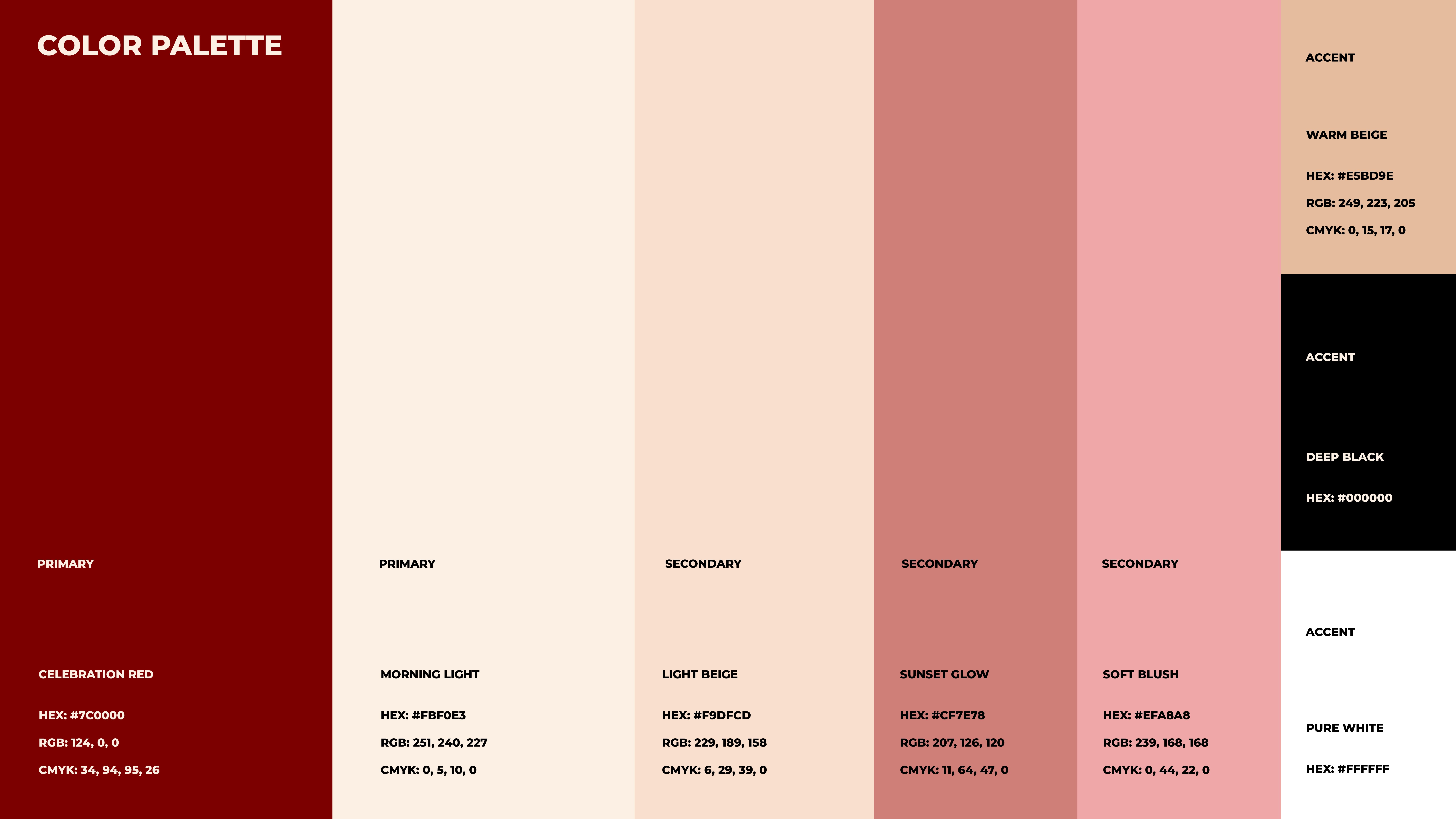
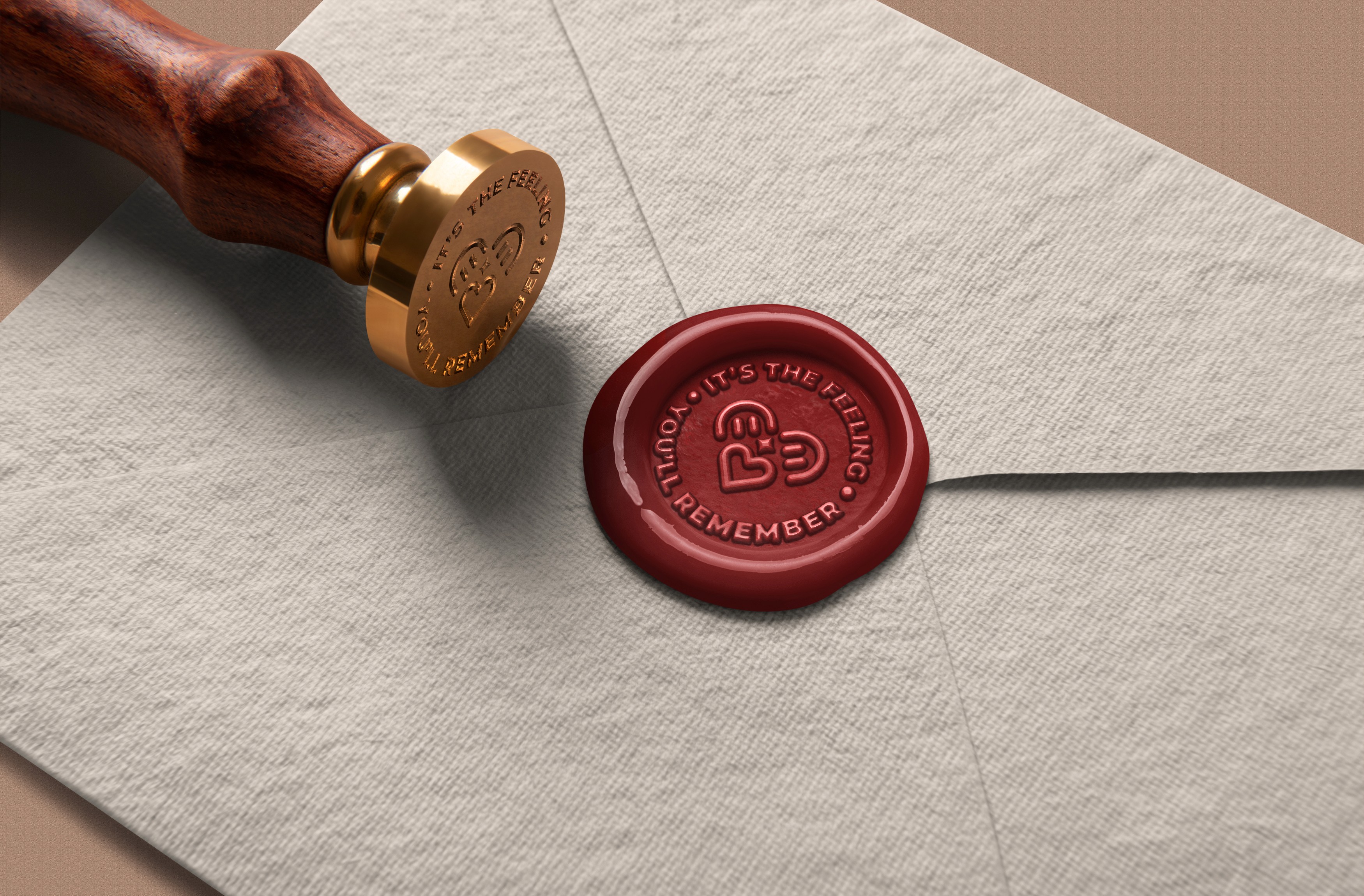
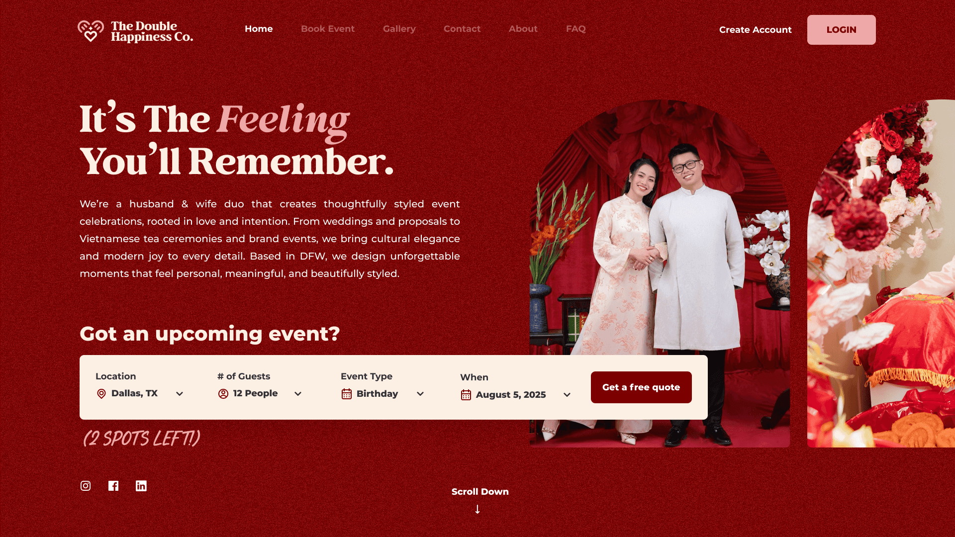
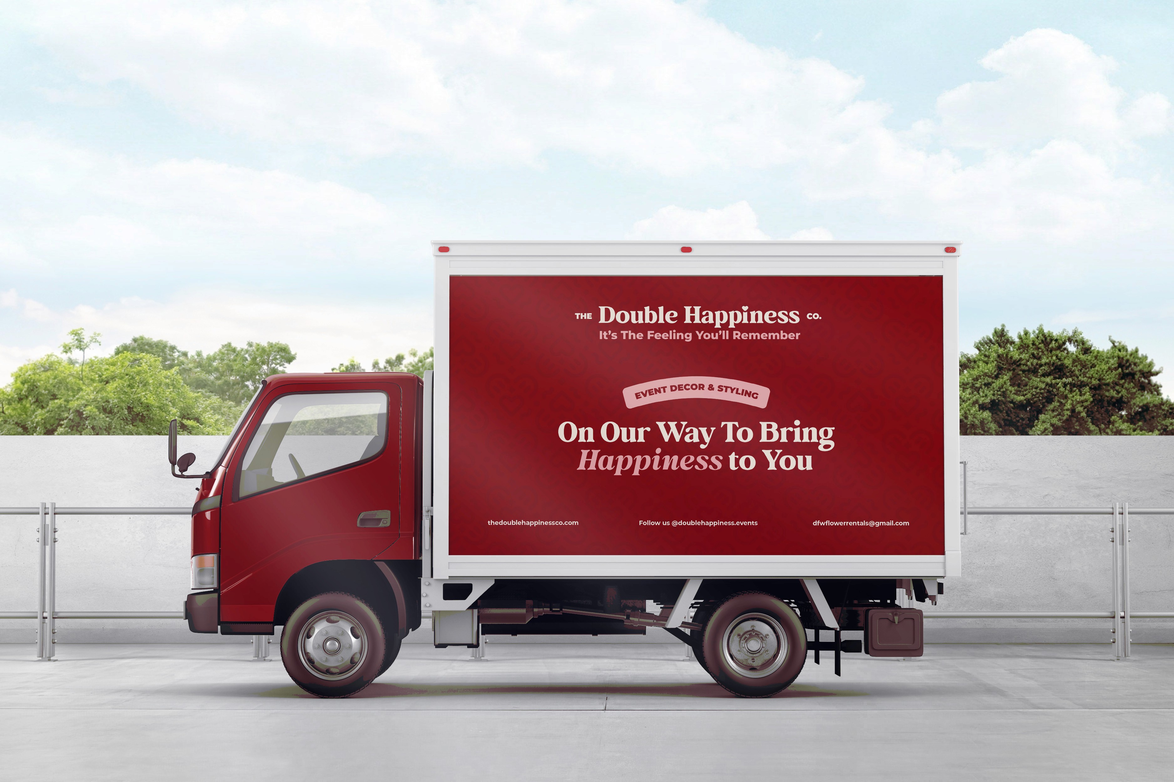
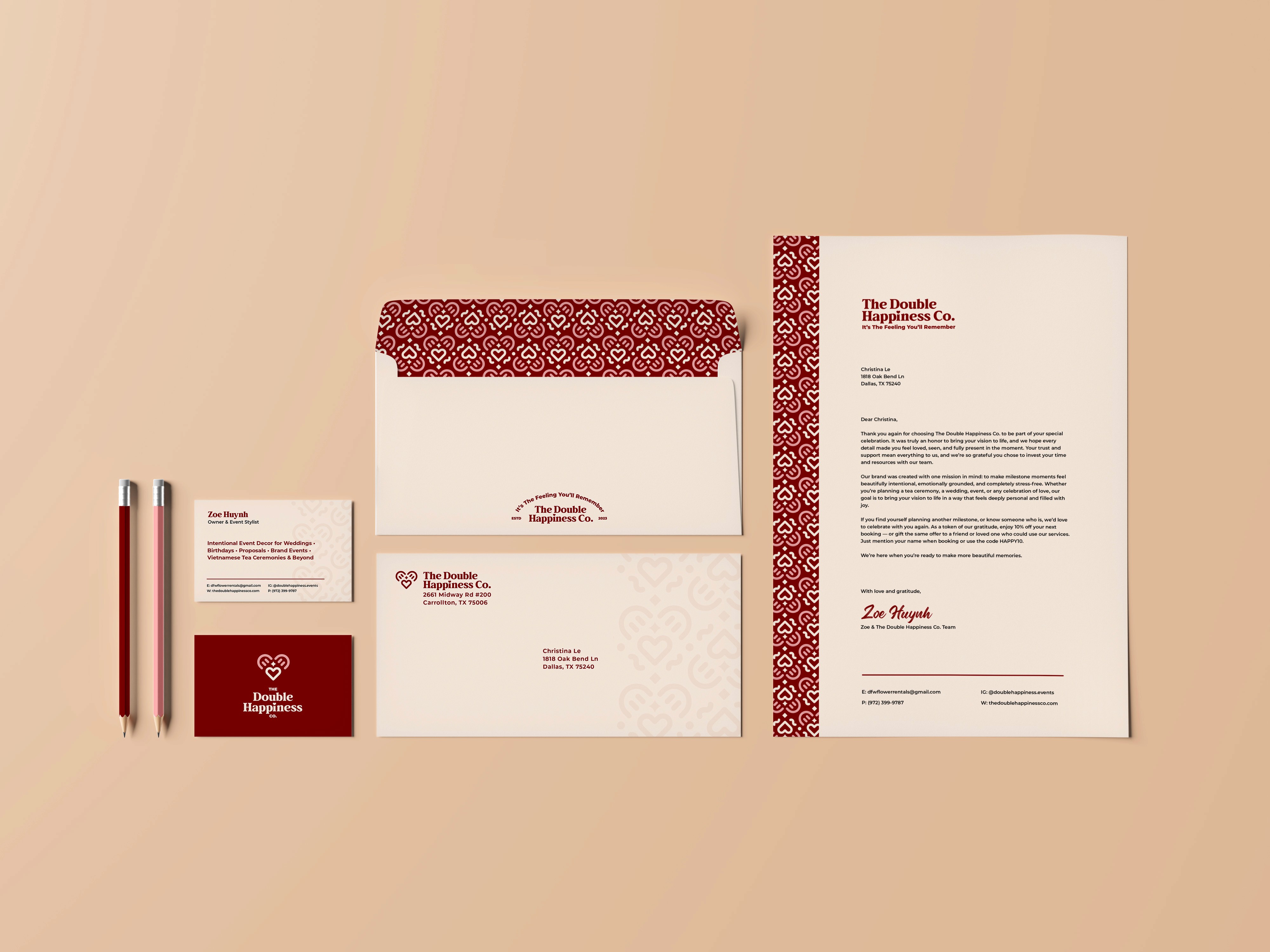
The logomark embodies a heart, smile, and spark ~ intentionally designed in a contemporary way while representing love, happiness, and joy into one symbol. The logo is complemented with a slab serif font that evokes warmth and personality, feeling both approachable yet slightly elegant. The color palette does the heavy lifting for leaning into that sense of tradition and culture with deep heritage reds, warm beiges, and softer pink & neutrals.
The logo expands into a seamless pattern that complements the logomark elements, infusing hints of celebration like confetti. To add more depth, grain texture, silk background imagery, and handcrafted illustrations are also incorporated into the brand's identity.

Concept
Their tagline: It's a Feeling You'll Remember.
Everything in the identity system was designed to reflect their tagline and carries this idea of "It's a Feeling You'll Remember". It describes the outcome from their service and not the service itself. That distinction matters because this positions them as a brand that truly cares about elevating the experience and moments they offer their clients, allowing them celebrate, let go, and enjoy being truly present.
PROJECTS
MORE WORK

NUROX
Brand Strategy
Logo Identity
Packaging Design
NUROX
Brand Strategy
Logo Identity
Packaging Design

Lulley
Brand Strategy
Logo Identity
Packaging Design
Lulley
Brand Strategy
Logo Identity
Packaging Design

3.OH Energy
Brand Strategy
Logo Identity
Packaging Design
3.OH Energy
Brand Strategy
Logo Identity
Packaging Design
Village (Coming Soon)
Brand Strategy
Logo Identity
Packaging Design
Village (Coming Soon)
Brand Strategy
Logo Identity
Packaging Design
Casabe Paul (Coming Soon)
Brand Strategy
Logo Identity
Packaging Design
Casabe Paul (Coming Soon)
Brand Strategy
Logo Identity
Packaging Design
2025
The Double Happiness Co
Brand Strategy
Logo Identity
Stationary Design
CREDITS
Brand Strategy & Identity Design: Dena Nguyen
Logo Animation: Dana Michelle
ABOUT
The Double Happiness Co. is an event styling & decor brand that specializes in tea ceremonies, weddings, and milestone celebrations.
Founded by a husband and wife duo, they're a small but mighty team who cares about intention styling rooted in culture and joy. As their business was expanding, so were their needs for branding.
Problem
Their previous logo was not scalable, felt outdated, and didn't reflect where they were heading towards.
Most event styling businesses follow the same design blueprint: cliché wedding aesthetics with hard-to-read cursive and thin serif fonts with old money aesthetics. They made it clear that they didn't want to blend in or follow this blueprint.
Another issue was that although they specialized in Vietnamese tea ceremonies, they didn't want to be boxed in or feel culturally limiting. The brand had to feel more welcoming to anyone planning a meaningful celebration and serve a more broad audience. The logo had to be a timeless, iconic mark that could stand alone.
Solution
A timeless, scalable visual identity that's rooted in joy, happiness, and love.
The logomark embodies a heart, smile, and spark ~ intentionally designed in a contemporary way while representing love, happiness, and joy into one symbol. The logo is complemented with a slab serif font that evokes warmth and personality, feeling both approachable yet slightly elegant. The color palette does the heavy lifting for leaning into that sense of tradition and culture with deep heritage reds, warm beiges, and softer pink & neutrals.
The logo expands into a seamless pattern that complements the logomark elements, infusing hints of celebration like confetti. To add more depth, grain texture, silk background imagery, and handcrafted illustrations are also incorporated into the brand's identity.
Concept
Their tagline: It's a Feeling You'll Remember.
Everything in the identity system was designed to reflect their tagline and carries this idea of "It's a Feeling You'll Remember". It describes the outcome from their service and not the service itself. That distinction matters because this positions them as a brand that truly cares about elevating the experience and moments they offer their clients, allowing them celebrate, let go, and enjoy being truly present.
PROJECTS
MORE WORK