2025
NUROX
Brand Strategy
Logo Identity
Packaging Design
CREDITS
Brand Strategy & Identity Design: Dena Nguyen
Logo Animation: Dana Michelle
About
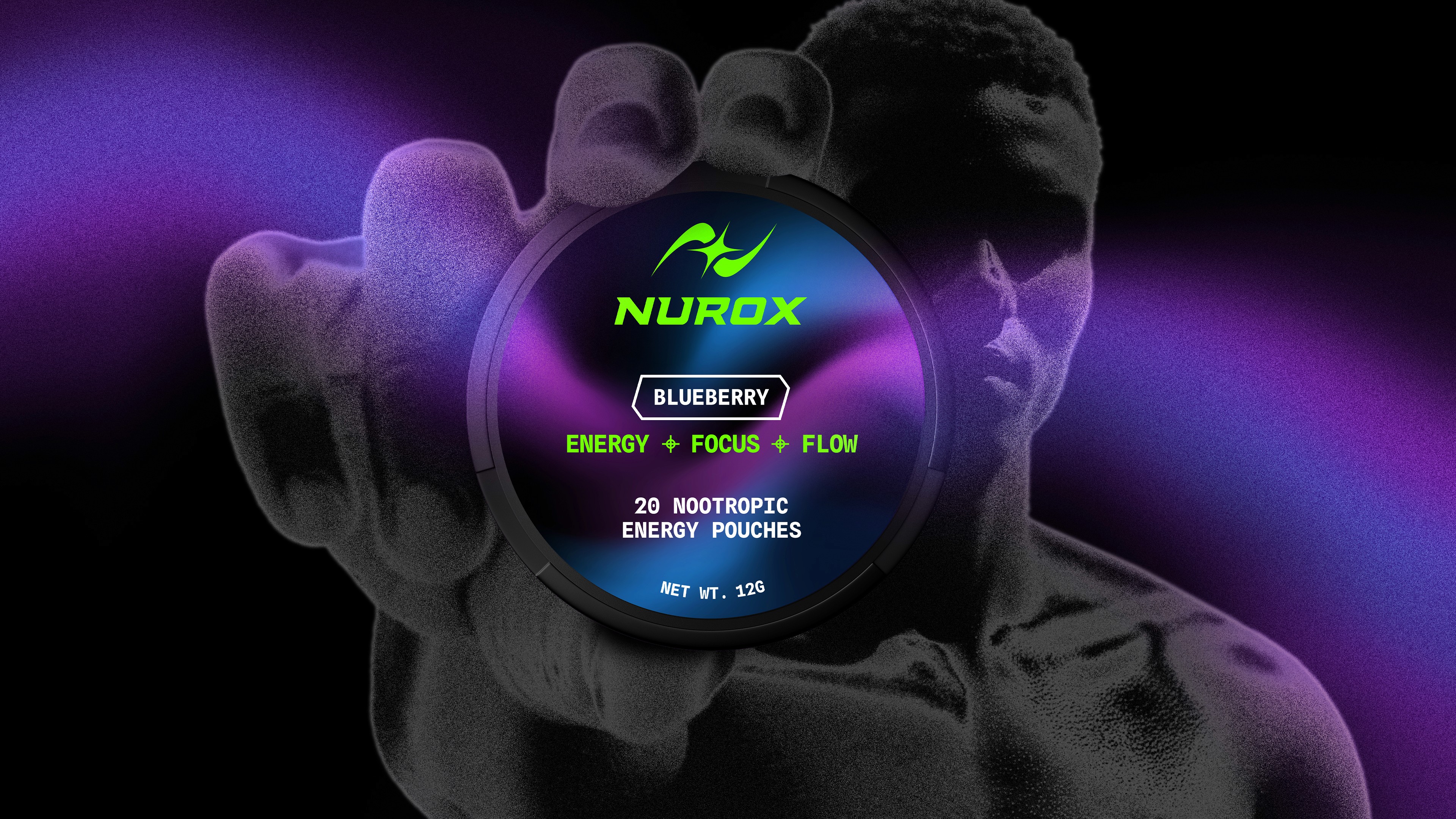
NUROX is a nootropic energy pouch designed to activate calm energy, sharp focus, and flow state.
This mental performance tool was created for ambitious individuals like high-performers, athletes, and operators who want to focus efficiently and value clarity, control, and precision.

Problem
The nootropic energy pouch market is filled with pouches that contains caffeine, nicotine, and/or tobacco. This left a gap for a healthier energy pouch that doesn't have those things.
NUROX stands out because it has NO caffeine, tobacco, or nicotine. It's a clean formula that includes: paraxanthine, alpha-GPC, L-tyrosine, kanna, L-theanine, and rhodiola rosea. These ingredients together activate calm focus, no spikes or crashes, and mental clarity within 15 minutes using buccal absorption (which is faster than pills, drinks, or gummies). With these unique differentiators in their market positioning, it was clear that the creative direction had to reflect their unique traits. When diving into market research, other energy pouches seem to lean into white, sterile, and clinical designs which made them all blend into the sea of sameness.


Solution
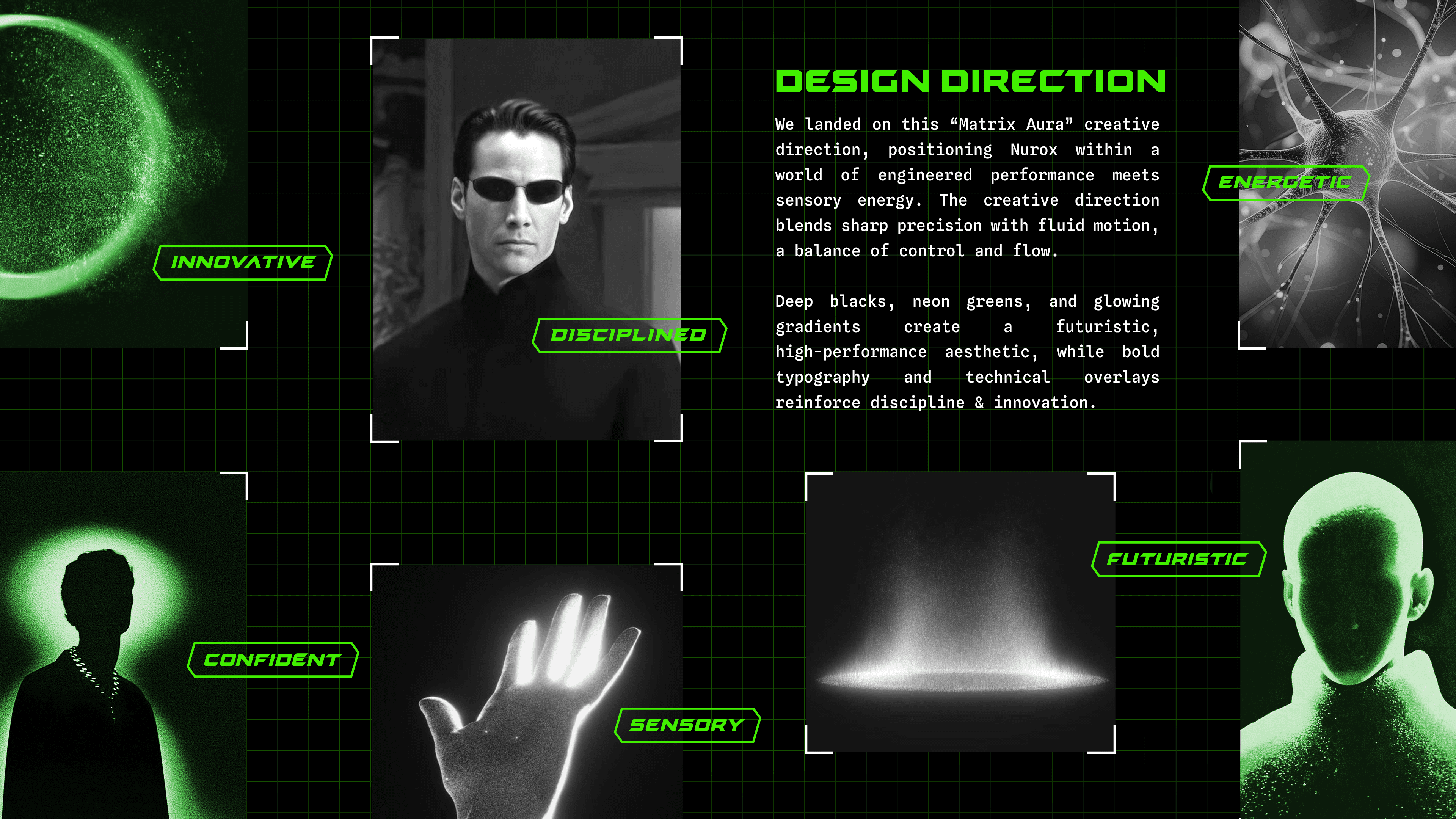
Design a visual identity rooted in brand strategy. It strikes a balance that feels futuristic yet sensory, calming yet energetic, and intelligently designed for the future of mental performance.
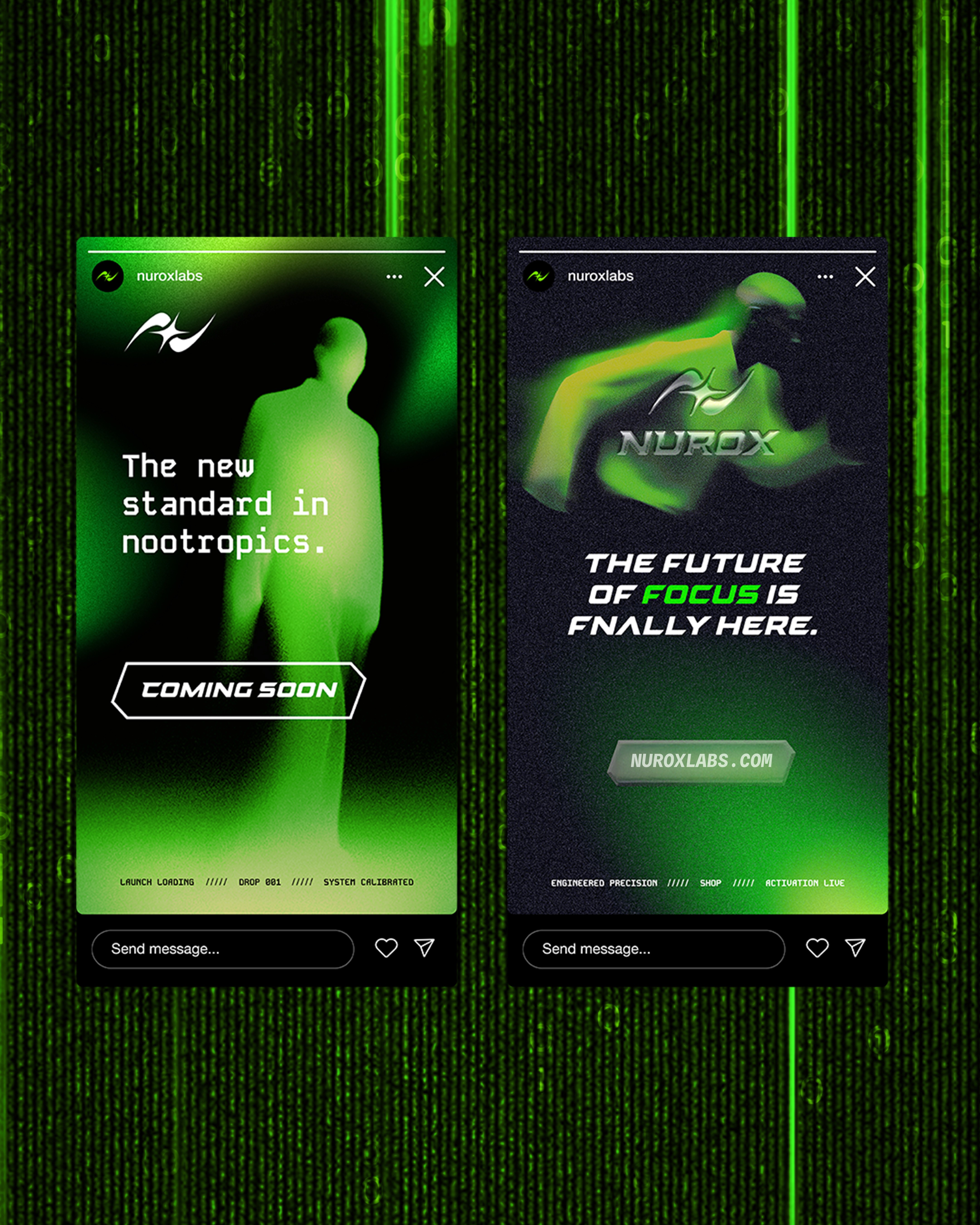
The result is a cohesive, distinct, and unique visual identity for NUROX that truly stands out in the nootropic energy pouch market, combining sensory gradients to evoke flow state and futuristic design to reflect innovative precision. From the logo to the packaging design, it signals forward movement, sharpness, and kinetic energy.


Concept
The creative direction doubled down on the idea of flow state, leaning into glowing gradients and particle dispersions to activate those sensory energies with a futuristic spin.
This was combined with a futuristic, engineered approach to balance the concept of “fluid motion meets controlled precision”. This idea extended across the visual identity design system, allowing for momentum, calm energy, clarity, discipline, and flow to exist all together. The electric green and black color palette signals high voltage energy with a sharp typography system to complement the identity with structure, edge, and utility.


PROJECTS
MORE WORK

Lulley
Brand Strategy
Logo Identity
Packaging Design
Lulley
Brand Strategy
Logo Identity
Packaging Design

3.OH Energy
Brand Strategy
Logo Identity
Packaging Design
3.OH Energy
Brand Strategy
Logo Identity
Packaging Design

The Double Happiness Co
Brand Strategy
Logo Identity
Packaging Design
The Double Happiness Co
Brand Strategy
Logo Identity
Packaging Design
Village (Coming Soon)
Brand Strategy
Logo Identity
Packaging Design
Village (Coming Soon)
Brand Strategy
Logo Identity
Packaging Design
Casabe Paul (Coming Soon)
Brand Strategy
Logo Identity
Packaging Design
Casabe Paul (Coming Soon)
Brand Strategy
Logo Identity
Packaging Design
2025
NUROX
Brand Strategy
Logo Identity
Packaging Design
CREDITS
Brand Strategy & Identity Design: Dena Nguyen
Logo Animation: Dana Michelle
About
NUROX is a nootropic energy pouch designed to activate calm energy, sharp focus, and flow state.
This mental performance tool was created for ambitious individuals like high-performers, athletes, and operators who want to focus efficiently and value clarity, control, and precision.
Problem
The nootropic energy pouch market is filled with pouches that contains caffeine, nicotine, and/or tobacco. This left a gap for a healthier energy pouch that doesn't have those things.
NUROX stands out because it has NO caffeine, tobacco, or nicotine. It's a clean formula that includes: paraxanthine, alpha-GPC, L-tyrosine, kanna, L-theanine, and rhodiola rosea. These ingredients together activate calm focus, no spikes or crashes, and mental clarity within 15 minutes using buccal absorption (which is faster than pills, drinks, or gummies). With these unique differentiators in their market positioning, it was clear that the creative direction had to reflect their unique traits. When diving into market research, other energy pouches seem to lean into white, sterile, and clinical designs which made them all blend into the sea of sameness.
Solution
Design a visual identity rooted in brand strategy. It strikes a balance that feels futuristic yet sensory, calming yet energetic, and intelligently designed for the future of mental performance.
The result is a cohesive, distinct, and unique visual identity for NUROX that truly stands out in the nootropic energy pouch market, combining sensory gradients to evoke flow state and futuristic design to reflect innovative precision. From the logo to the packaging design, it signals forward movement, sharpness, and kinetic energy.
Concept
The creative direction doubled down on the idea of flow state, leaning into glowing gradients and particle dispersions to activate those sensory energies with a futuristic spin.
This was combined with a futuristic, engineered approach to balance the concept of “fluid motion meets controlled precision”. This idea extended across the visual identity design system, allowing for momentum, calm energy, clarity, discipline, and flow to exist all together. The electric green and black color palette signals high voltage energy with a sharp typography system to complement the identity with structure, edge, and utility.
PROJECTS
MORE WORK
Lulley
Brand Strategy
Logo Identity
Packaging Design
3.OH Energy
Brand Strategy
Logo Identity
Packaging Design
The Double Happiness Co
Brand Strategy
Logo Identity
Packaging Design
Village (Coming Soon)
Brand Strategy
Logo Identity
Packaging Design
Casabe Paul (Coming Soon)
Brand Strategy
Logo Identity
Packaging Design