2026
Village
Brand Strategy
Logo Identity
Website Design
CREDITS
Brand Strategy & Identity Design: Dena Nguyen
Logo Animation: Dana Michelle
ABOUT


Problem
Village had a strong idea with a complex story. The brand needed to bring together residents, landowners, local businesses, and community partners around one shared system, while making the concept feel simple and approachable.
The challenge was creating an identity that could communicate food access, local economic opportunity, and community ownership without feeling overly corporate, overly tech-driven, or like a traditional nonprofit.


Solution
I started by defining the brand strategy first, clarifying who Village was speaking to, what each audience needed, and where the brand could sit within the existing landscape. From there, I translated that strategy into a visual identity built around connection, growth, and local ownership.
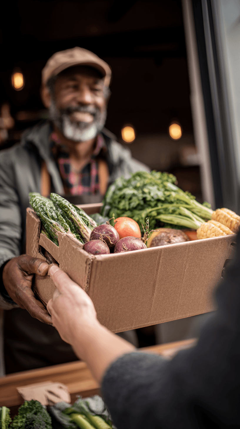
The identity combines earthy colors, bold typography, hand-drawn elements, organic textures, and real-world photography to give the brand a sense of warmth and humanity. The logo itself brings together ideas of home, growth, and collective support, creating a simple visual symbol for what Village is trying to build.
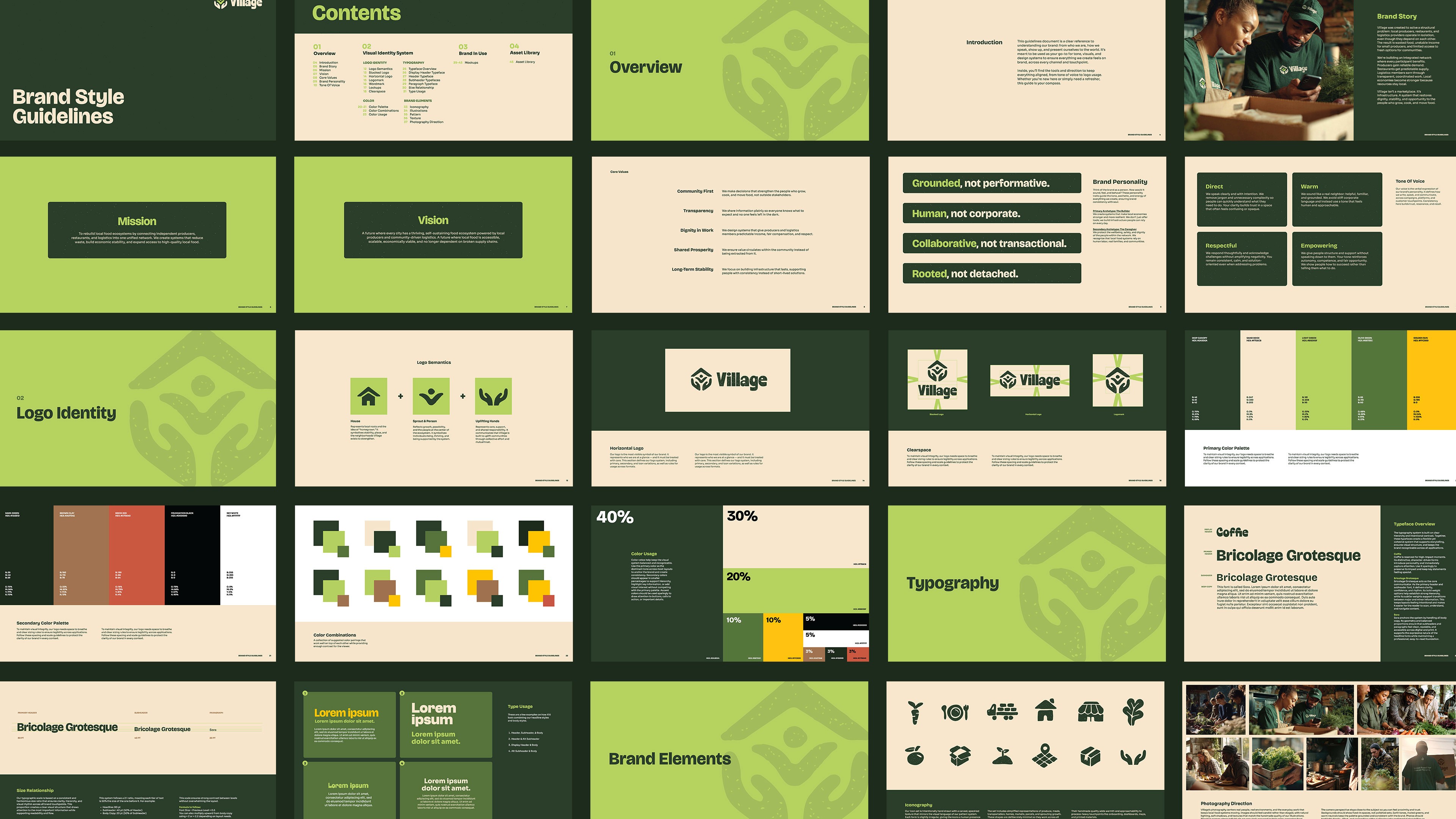
I also built out the identity as a flexible system rather than just a logo, with supporting iconography, patterns, illustrations, photography direction, typography, and clear usage guidelines that could carry across both digital and physical touchpoints.


Concept
The core idea was to make the brand feel like the community it was built for: grounded, connected, and full of potential. The visual identity brings together three ideas from the brand story: home, growth, and collective support. The logo combines a house, sprouting figure, and uplifting hands to represent how Village connects people, land, and opportunity.
From there, I built a visual language around the idea of many individual parts working together as one ecosystem. The repeating logo pattern references a connected community, while the hand-drawn icons, organic marks, tactile textures, and candid photography keep the system feeling human rather than polished or corporate.


PROJECTS
MORE WORK

Casabe Paul
Brand Strategy
Logo Identity
Packaging Design
Casabe Paul
Brand Strategy
Logo Identity
Packaging Design
NUROX
Brand Strategy
Logo Identity
Packaging Design
NUROX
Brand Strategy
Logo Identity
Packaging Design
Lulley
Brand Strategy
Logo Identity
Packaging Design
Lulley
Brand Strategy
Logo Identity
Packaging Design
3.OH Energy
Brand Strategy
Logo Identity
Packaging Design
3.OH Energy
Brand Strategy
Logo Identity
Packaging Design
The Double Happiness Co
Brand Strategy
Logo Identity
Packaging Design
The Double Happiness Co
Brand Strategy
Logo Identity
Packaging Design
2026
Village
Brand Strategy
Logo Identity
Website Design
CREDITS
Brand Strategy & Identity Design: Dena Nguyen
Logo Animation: Dana Michelle
ABOUT
Problem
Village had a strong idea with a complex story. The brand needed to bring together residents, landowners, local businesses, and community partners around one shared system, while making the concept feel simple and approachable.
The challenge was creating an identity that could communicate food access, local economic opportunity, and community ownership without feeling overly corporate, overly tech-driven, or like a traditional nonprofit.
Solution
I started by defining the brand strategy first, clarifying who Village was speaking to, what each audience needed, and where the brand could sit within the existing landscape. From there, I translated that strategy into a visual identity built around connection, growth, and local ownership.
The identity combines earthy colors, bold typography, hand-drawn elements, organic textures, and real-world photography to give the brand a sense of warmth and humanity. The logo itself brings together ideas of home, growth, and collective support, creating a simple visual symbol for what Village is trying to build.
I also built out the identity as a flexible system rather than just a logo, with supporting iconography, patterns, illustrations, photography direction, typography, and clear usage guidelines that could carry across both digital and physical touchpoints.
Concept
The core idea was to make the brand feel like the community it was built for: grounded, connected, and full of potential. The visual identity brings together three ideas from the brand story: home, growth, and collective support. The logo combines a house, sprouting figure, and uplifting hands to represent how Village connects people, land, and opportunity.
From there, I built a visual language around the idea of many individual parts working together as one ecosystem. The repeating logo pattern references a connected community, while the hand-drawn icons, organic marks, tactile textures, and candid photography keep the system feeling human rather than polished or corporate.
PROJECTS
MORE WORK
2026
Village
Brand Strategy
Logo Identity
Website Design
CREDITS
Brand Strategy & Identity Design: Dena Nguyen
Logo Animation: Dana Michelle
ABOUT
Problem
Village had a strong idea with a complex story. The brand needed to bring together residents, landowners, local businesses, and community partners around one shared system, while making the concept feel simple and approachable.
The challenge was creating an identity that could communicate food access, local economic opportunity, and community ownership without feeling overly corporate, overly tech-driven, or like a traditional nonprofit.
Solution
I started by defining the brand strategy first, clarifying who Village was speaking to, what each audience needed, and where the brand could sit within the existing landscape. From there, I translated that strategy into a visual identity built around connection, growth, and local ownership.
The identity combines earthy colors, bold typography, hand-drawn elements, organic textures, and real-world photography to give the brand a sense of warmth and humanity. The logo itself brings together ideas of home, growth, and collective support, creating a simple visual symbol for what Village is trying to build.
I also built out the identity as a flexible system rather than just a logo, with supporting iconography, patterns, illustrations, photography direction, typography, and clear usage guidelines that could carry across both digital and physical touchpoints.
Concept
The core idea was to make the brand feel like the community it was built for: grounded, connected, and full of potential. The visual identity brings together three ideas from the brand story: home, growth, and collective support. The logo combines a house, sprouting figure, and uplifting hands to represent how Village connects people, land, and opportunity.
From there, I built a visual language around the idea of many individual parts working together as one ecosystem. The repeating logo pattern references a connected community, while the hand-drawn icons, organic marks, tactile textures, and candid photography keep the system feeling human rather than polished or corporate.
PROJECTS
MORE WORK